Predict Customer Churn
Propensity Scoring Model using Supervised ML
An excerpt from an article written by Sree, published in ‘Towards Data Science’ Journal.
Objective
A step-by-step approach to predict customer attrition using supervised machine learning algorithms in Python.
Details
Customer attrition (a.k.a customer churn) is one of the biggest expenditures of any organization. If we could figure out why a customer leaves and when they leave with reasonable accuracy, it would immensely help the organization to strategize their retention initiatives manifold. Let’s make use of a customer transaction dataset from Kaggle to understand the key steps involved in predicting customer attrition in Python.
Supervised Machine Learning is nothing but learning a function that maps an input to an output based on example input-output pairs. A supervised machine learning algorithm analyzes the training data and produces an inferred function, which can be used for mapping new examples. Given that we have data on current and prior customer transactions in the telecom dataset, this is a standardized supervised classification problem that tries to predict a binary outcome (Y/N).
By the end of this article, let’s attempt to solve some of the key business challenges pertaining to customer attrition like say, (1) what is the likelihood of an active customer leaving an organization? (2) what are key indicators of a customer churn? (3) what retention strategies can be implemented based on the results to diminish prospective customer churn?
In real-world, we need to go through seven major stages to successfully predict customer churn:
Section A: Data Preprocessing
Section B: Data Evaluation
Section C: Model Selection
Section D: Model Evaluation
Section E: Model Improvement
Section F: Future Predictions
Section G: Model Deployment
To understand the business challenge and the proposed solution, I would recommend you to download the dataset and to code with me. Fee free to ask me if you have any questions as you work along. Let’s look into each one of these aforesaid steps in detail here below
Section A: Data Preprocessing
If you had asked the 20-year-old me, I would have jumped straight into model selection as its coolest thing to do in machine learning. But like in life, wisdom kicks in at a later stage! After witnessing the real-world Machine Learning business challenges, I can’t stress the importance of Data preprocessing and Data Evaluation.
Always remember the following golden rule in predictive analytics: “Your model is only as good as your data”
Understanding the end-to-end structure of your dataset and reshaping the variables is the gateway to a qualitative predictive modelling initiative.
Step 0: Restart the session:
It’s a good practice to restart the session and to remove all the temporary variables from the interactive development environment before we start coding. So let’s restart the session, clear the cache and start afresh!
try:
    from IPython import get_ipython
    get_ipython().magic('clear')
    get_ipython().magic('reset -f')
except:
    pass
Step 1: Import relevant libraries:
Import all the relevant python libraries for building supervised machine learning algorithms.
#Standard libraries for data analysis:

import numpy as np
import matplotlib.pyplot as plt
import pandas as pd
from scipy.stats import norm, skew
from scipy import stats
import statsmodels.api as sm

# sklearn modules for data preprocessing:

from sklearn.impute import SimpleImputer
from sklearn.preprocessing
import LabelEncoder, OneHotEncoder
from sklearn.compose
import ColumnTransformer
from sklearn.preprocessing
import OneHotEncoder
from sklearn.model_selection
import train_test_split
from sklearn.preprocessing
import StandardScaler

#sklearn modules for Model Selection:

from sklearn
import svm, tree, linear_model, neighbors
from sklearnimport naive_bayes, ensemble,
discriminant_analysis, gaussian_process

from sklearn.neighbors
import KNeighborsClassifier
from sklearn.discriminant_analysis
import LinearDiscriminantAnalysis
from xgboost import XGBClassifier
from sklearn.linear_model
import LogisticRegression
from sklearn.svm import SVC
from sklearn.neighbors
import KNeighborsClassifier
from sklearn.naive_bayes
import GaussianNB
from sklearn.tree
import DecisionTreeClassifier
from sklearn.ensemble
import RandomForestClassifier

#sklearn modules for Model Evaluation & Improvement:

from sklearn.metrics
import confusion_matrix, accuracy_score
from sklearn.metrics
import f1_score, precision_score,
recall_score, fbeta_score

from statsmodels.stats.outliers_influence
import variance_inflation_factor

from sklearn.model_selection
import cross_val_score
from sklearn.model_selection
import GridSearchCV
from sklearn.model_selection
import ShuffleSplit
from sklearn.model_selection
import KFold
from sklearn
import feature_selection
from sklearn
import model_selection
from sklearn
import metrics
from sklearn.metrics
import classification_report,
precision_recall_curve

from sklearn.metrics
import auc, roc_auc_score,
roc_curve
from sklearn.metrics
import make_scorer,recall_score, log_loss
from sklearn.metrics
import average_precision_score

#Standard libraries for data visualization:

import seaborn as sn
from matplotlib import pyplot
import matplotlib.pyplot as plt
import matplotlib.pylab as pylab
import matplotlib
%matplotlib inline
color = sn.color_palette()
import matplotlib.ticker as mtick
from IPython.display import display
pd.options.display.max_columns = None
from pandas.plotting import scatter_matrix
from sklearn.metrics import roc_curve

#Miscellaneous Utilitiy Libraries:

import random
import os
import re
import sys
import timeit
import string
import time
from datetime import datetime
from time import time
from dateutil.parser import parse
import joblib
Step 2: Set up the current working directory:
os.chdir(r"C:/Users/srees/
Propensity Scoring Models/
Predict Customer Churn/")
Step 3: Import the dataset:
Let’s load the input dataset into the python notebook in the current working directory.
dataset = pd.read_csv('1.Input/customer_churn_data.csv')
Step 4: Evaluate data structure:
In this section, we need to look at the dataset in general and each column in detail to get a better understanding of the input data so as to aggregate the fields when needed.
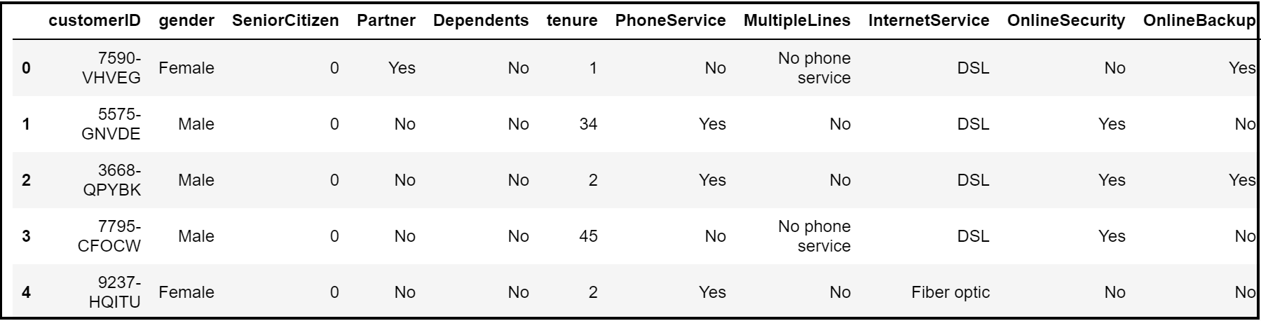
From the head & column methods, we get an idea that this is a telco customer churn dataset where each record entails the nature of subscription, tenure, frequency of payment and churn (signifying their current status).
dataset.head()
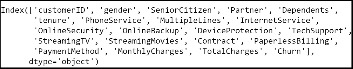
dataset.columns
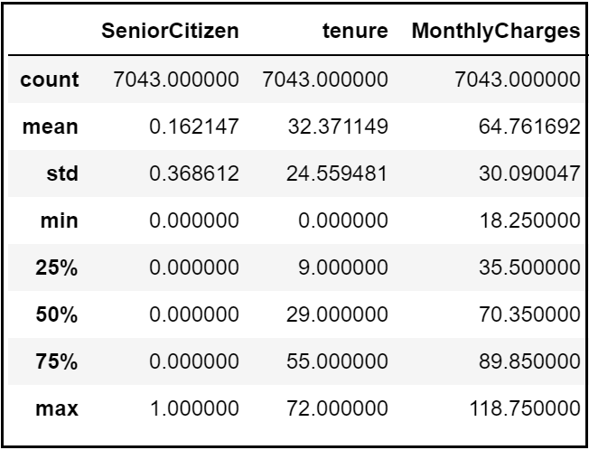
A quick describe method reveals that the telecom customers are staying on average for 32 months and are paying $64 per month. However, this could potentially be because different customers have different contracts.
dataset.describe()
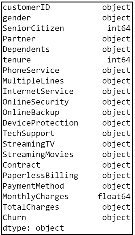
From the look of it, we can presume that the dataset contains several numerical and categorical columns providing various information on the customer transactions.
dataset.dtypes
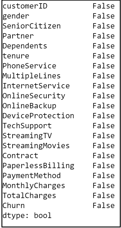
Re-validate column data types and missing values:
Always keep an eye onto the missing values in a dataset. The missing values could mess up model building and accuracy. Hence we need to take care of missing values (if any) before we compare and select a model.
dataset.columns.to_series().
groupby(dataset.dtypes).groups
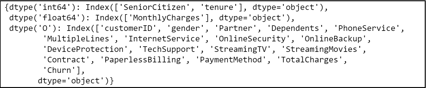
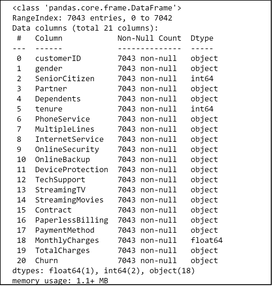
The dataset contains 7043 rows and 21 columns and there seem to be no missing values in the dataset.
dataset.info()
dataset.isna().any()
Identify unique values:
‘Payment Methods’ and ‘Contract’ are the two categorical variables in the dataset. When we look into the unique values in each categorical variables, we get an insight that the customers are either on a month-to-month rolling contract or on a fixed contract for one/two years. Also, they are paying bills via credit card, bank transfer or electronic checks.
#Unique values in each categorical variable:

dataset["PaymentMethod"].nunique()

dataset["PaymentMethod"].unique()

dataset["Contract"].nunique()

dataset["Contract"].unique()
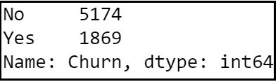
Step 5: Check target variable distribution:
Let’s look at the distribution of churn values. This is quite a simple yet crucial step to see if the dataset upholds any class imbalance issues. As you can see below, the data set is imbalanced with a high proportion of active customers compared to their churned counterparts.
dataset["Churn"].value_counts()
Step 6: Clean the dataset:
dataset['TotalCharges'] = pd.to_numeric(dataset[
'TotalCharges'],errors='coerce')
dataset['TotalCharges'] = dataset[
'TotalCharges'].astype("float")
Step 7: Take care of missing data:
As we saw earlier, the data provided has no missing values and hence this step is not required for the chosen dataset. I would like to showcase the steps here for any future references.
dataset.info()

dataset.isna().any()

Find the average and fill missing values programmatically:
If we had any missing values in the numeric columns of the dataset, then we should find the average of each one of those columns and fill their missing values. Here’s a snippet of code to do the same step programmatically.
na_cols = dataset.isna().any()

na_cols = na_cols[na_cols == True].reset_index()

na_cols = na_cols["index"].tolist()

for col in dataset.columns[1:]:
     if col in na_cols:
        if dataset[col].dtype != 'object':
             dataset[col] =  dataset[col].
             fillna(dataset[col].mean()).round(0)
Revalidate NA’s:
It’s always a good practice to revalidate and ensure that we don’t have any more null values in the dataset.
dataset.isna().any()

Step 8: Label Encode Binary data:
Machine Learning algorithms can typically only have numerical values as their independent variables. Hence label encoding is quite pivotal as they encode categorical labels with appropriate numerical values. Here we are label encoding all categorical variables that have only two unique values. Any categorical variable that has more than two unique values are dealt with Label Encoding and one-hot Encoding in the subsequent sections.
#Create a label encoder object
le = LabelEncoder()

# Label Encoding will be
used for columns with 2
or less unique values

le_count = 0
for col in dataset.columns[1:]:
    if dataset[col].dtype == 'object':
        if len(
        list(dataset[col].unique())) <= 2:
            le.fit(
            dataset[col])
            dataset[col] =
            le.transform(dataset[col])
            le_count += 1

print('{} columns were label encoded.'.
format(le_count))
Section B: Data Evaluation
Step 9:
Exploratory Data Analysis: Let’s try to explore and visualize our data set by doing distribution of independent variables to better understand the patterns in the data and to potentially form some hypothesis.
Step 9.1. Plot histogram of numeric Columns:
dataset2 = dataset[['gender',
'SeniorCitizen', 'Partner','Dependents',
'tenure', 'PhoneService', 'PaperlessBilling',
'MonthlyCharges', 'TotalCharges']]
#Histogram:

fig = plt.figure(figsize=(15, 12))
plt.suptitle('Histograms of Numerical Columns\n',
horizontalalignment="center",
fontstyle = "normal", fontsize = 24,
fontfamily = "sans-serif")
for i in range(dataset2.shape[1]):
    plt.subplot(6, 3, i + 1)
    f = plt.gca()
    f.set_title(dataset2.columns.values[i])
vals = np.size(dataset2.iloc[:, i].unique())
    if vals >= 100:
        vals = 100

plt.hist(dataset2.iloc[:, i],
bins=vals, color = '#ec838a')
plt.tight_layout(rect=[0, 0.03, 1, 0.95])
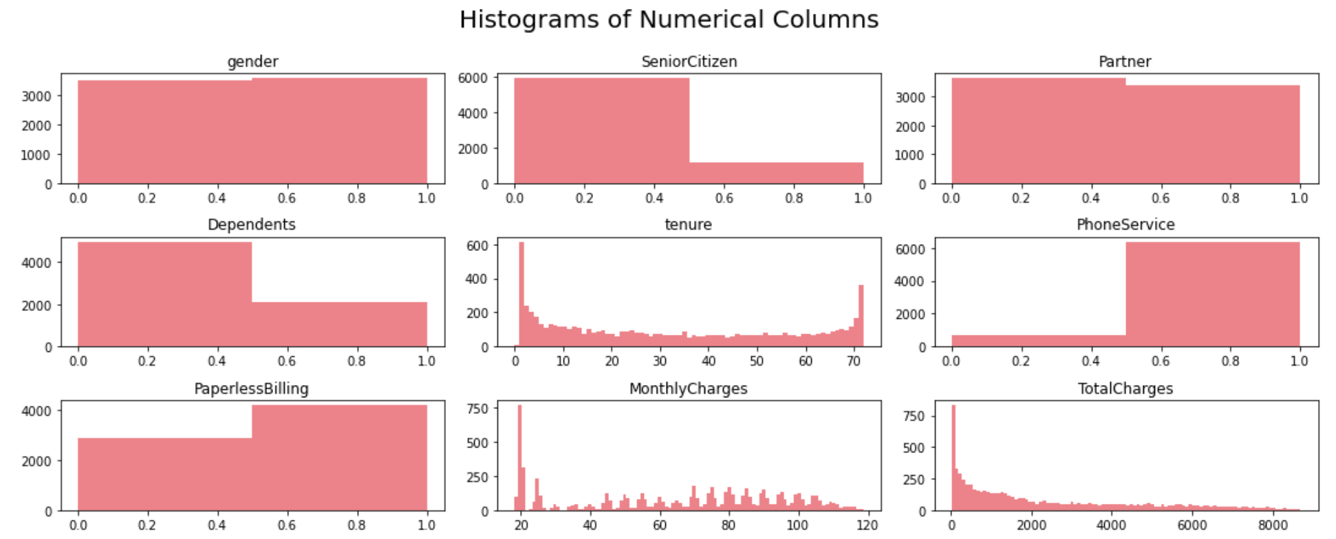
A few observations can be made based on the histograms for numerical variables:
1) Gender distribution shows that the dataset features a relatively equal proportion of male and female customers. Almost half of the customers in our dataset are female whilst the other half are male.
2) Most of the customers in the dataset are younger people.
3) Not many customers seem to have dependents whilst almost half of the customers have a partner.
4) There are a lot of new customers in the organization (less than 10 months old) followed by a loyal customer segment that stays for more than 70 months on average.
5) Most of the customers seem to have phone service and 3/4th of them have opted for paperless Billing.
6) Monthly charges span anywhere between $18 to $118 per customer with a huge proportion of customers on $20 segment.
Step 9.2. Analyze the distribution of categorical variables:
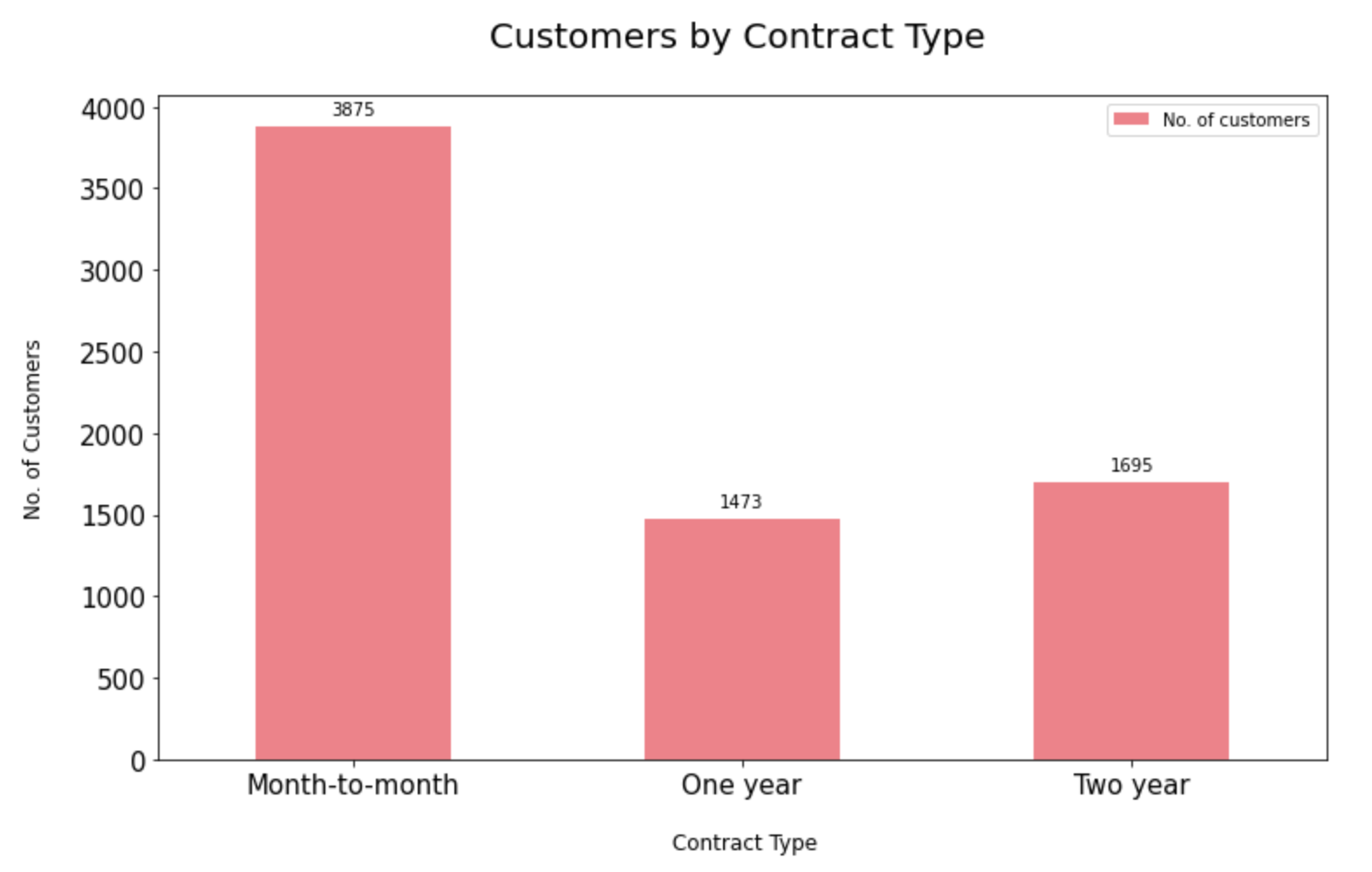
9.2.1. Distribution of contract type:
Most of the customers seem to have a prepaid connection with the telecom company. On the other hand, there are a more or less equal proportion of customers in the 1-year and 2-year contracts.
contract_split = dataset[[
"customerID", "Contract"]]
sectors = contract_split.groupby ("Contract")
contract_split =
pd.DataFrame(sectors[
"customerID"].count())
contract_split.rename(
columns={'customerID':
'No. of customers'}, inplace=True)
ax =  contract_split[["No. of customers"]].
plot.bar(title = 'Customers by Contract Type',
legend =True, table = False,
grid = False,  subplots = False,figsize =(12, 7),
color ='#ec838a',
fontsize = 15, stacked=False)
plt.ylabel('No. of Customers\n',
horizontalalignment="center",fontstyle = "normal",
fontsize = "large", fontfamily = "sans-serif")
plt.xlabel('\n Contract Type',
horizontalalignment="center",fontstyle = "normal",
fontsize = "large", fontfamily = "sans-serif")
plt.title('Customers by Contract Type \n',
horizontalalignment="center",fontstyle = "normal",
fontsize = "22", fontfamily = "sans-serif")
plt.legend(loc='top right', fontsize = "medium")
plt.xticks(rotation=0, horizontalalignment="center")
plt.yticks(rotation=0, horizontalalignment="right")
x_labels = np.array(contract_split[[
"No. of customers"]])
def add_value_labels(ax, spacing=5):
    for rect in ax.patches:
        y_value = rect.get_height()
        x_value = rect.get_x() +
        rect.get_width() / 2
        space = spacing
        va = 'bottom'
        if y_value < 0:
            space *= -1
            va = 'top'
        label = "{:.0f}".format(y_value)

            ax.annotate(
            label,
            (x_value, y_value),
            xytext=(0, space),
            textcoords="offset points",
            ha='center',
            va=va)

add_value_labels(ax)
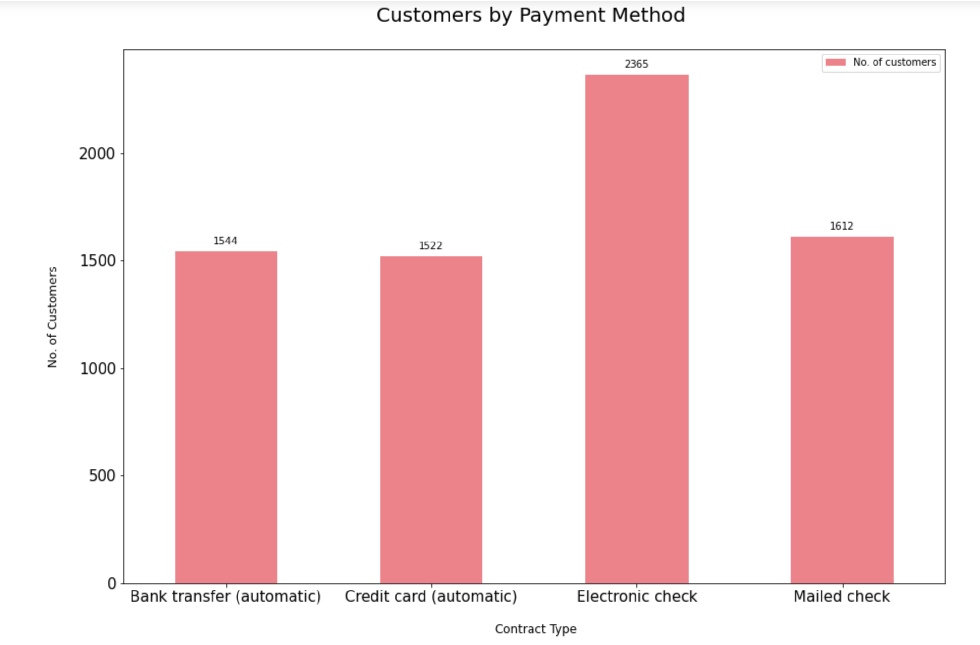
9.2.2. Distribution of payment method type:
The dataset indicates that customers prefer to pay their bills electronically the most followed by bank transfer, credit card and mailed checks.
payment_method_split = dataset[[
"customerID", "PaymentMethod"]]
sectors = payment_method_split.
groupby ("PaymentMethod")
payment_method_split  = pd.DataFrame(
sectors["customerID"].count())
payment_method_split.rename(
columns={'customerID':'No. of customers'},
inplace=True)
ax =  payment_method_split [[
"No. of customers"]].plot.bar(
title = 'Customers by Payment Method',
legend =True, table = False, grid = False,
subplots = False,  figsize =(15, 10),
color ='#ec838a', fontsize = 15,
stacked=False)
plt.ylabel('No. of Customers\n',
horizontalalignment="center",
fontstyle = "normal",
fontsize = "large",
fontfamily = "sans-serif")
plt.xlabel('\n Contract Type',
horizontalalignment="center",
fontstyle = "normal",
fontsize = "large",
fontfamily = "sans-serif")
plt.title('Customers by Payment Method \n',
horizontalalignment="center",
fontstyle = "normal", fontsize = "22",
fontfamily = "sans-serif")
plt.legend(loc='top right',
fontsize = "medium")
plt.xticks(rotation=0,
horizontalalignment="center")
plt.yticks(rotation=0,
horizontalalignment="right")
x_labels = np.array(
payment_method_split [["No. of customers"]])
def add_value_labels(ax, spacing=5):
    for rect in ax.patches:
        y_value = rect.get_height()
        x_value = rect.get_x() +
        rect.get_width() / 2
        space = spacing
        va = 'bottom'
        if y_value < 0:
            space *= -1
            va = 'top'
        label = "{:.0f}".format(y_value)

           ax.annotate(label,
           (x_value, y_value),
            xytext=(0, space),
            textcoords="offset points",
            ha='center',va=va)
add_value_labels(ax)
9.2.3. Distribution of label encoded categorical variables:
services= ['PhoneService','MultipleLines',
'InternetService','OnlineSecurity',
'OnlineBackup','DeviceProtection',
'TechSupport','StreamingTV','StreamingMovies']
fig, axes = plt.subplots(nrows = 3,ncols = 3,
figsize = (15,12))
for i, item in enumerate(services):
    if i < 3:
    ax = dataset[item].value_counts().plot(
    kind = 'bar',ax=axes[i,0],
    rot = 0, color ='#f3babc' )

    elif i >=3 and i < 6:
    ax = dataset[item].value_counts().plot(
    kind = 'bar',ax=axes[i-3,1],
    rot = 0,color ='#9b9c9a')

    elif i < 9:
    ax = dataset[item].value_counts().plot(
    kind = 'bar',ax=axes[i-6,2],rot = 0,
    color = '#ec838a')ax.set_title(item)
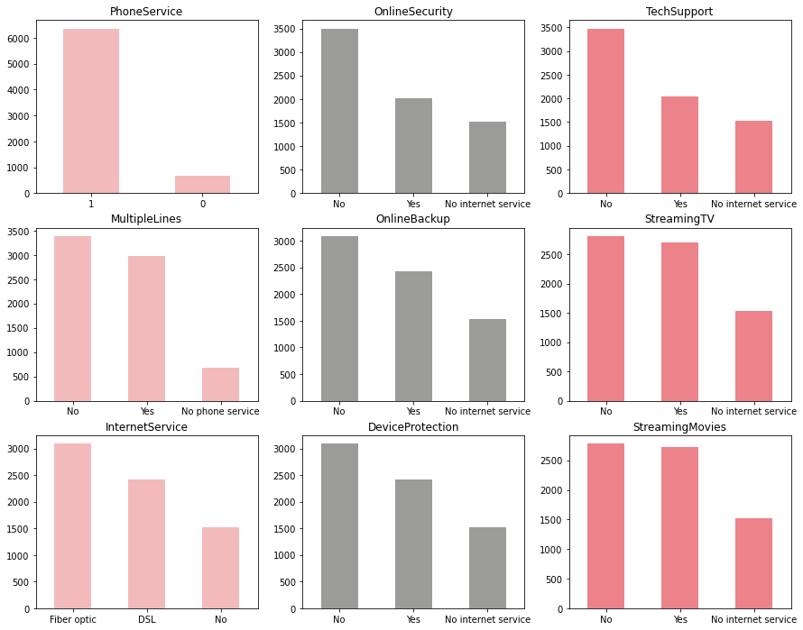
1) Most of the customers have phone service out of which almost half of the customers have multiple lines.
2) 3/4th of the customers have opted for internet service via Fiber Optic and DSL connections with almost half of the internet users subscribing to streaming TV and movies.
3) Customers who have availed Online Backup, Device Protection, Technical Support and Online Security features are a minority.
Step 9.3: Analyze the churn rate by categorical variables:
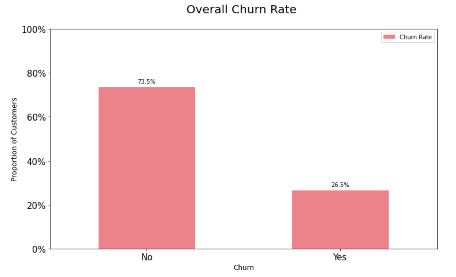
9.3.1. Overall churn rate:
A preliminary look at the overall churn rate shows that around 74% of the customers are active. As shown in the chart below, this is an imbalanced classification problem. Machine learning algorithms work well when the number of instances of each class is roughly equal. Since the dataset is skewed, we need to keep that in mind while choosing the metrics for model selection.
import matplotlib.ticker as mtick
churn_rate = dataset[["Churn", "customerID"]]
churn_rate ["churn_label"] =
pd.Series(
np.where((churn_rate["Churn"] == 0),
"No", "Yes"))
sectors = churn_rate .groupby ("churn_label")
churn_rate = pd.DataFrame(sectors[
"customerID"].count())
churn_rate ["Churn Rate"] = (
churn_rate ["customerID"]/
sum(churn_rate ["customerID"]) )*100
ax =  churn_rate[["Churn Rate"]].
plot.bar(title = 'Overall Churn Rate',
legend =True, table = False,grid = False,
subplots = False, figsize =(12, 7),
color = '#ec838a', fontsize = 15, stacked=False,
ylim =(0,100))
plt.ylabel('Proportion of Customers',
horizontalalignment="center",
fontstyle = "normal", fontsize = "large",
= "sans-serif")
plt.xlabel('Churn',
horizontalalignment="center",fontstyle = "normal",
fontsize = "large", fontfamily = "sans-serif")
plt.title('Overall Churn Rate \n',
horizontalalignment="center",
fontstyle = "normal", fontsize = "22",
fontfamily = "sans-serif")
plt.legend(loc='top right',
fontsize = "medium")
plt.xticks(rotation=0,
horizontalalignment="center")
plt.yticks(rotation=0,
horizontalalignment="right")
ax.yaxis.set_major_formatter(
mtick.PercentFormatter())
x_labels = np.array(
churn_rate[["customerID"]])
def add_value_labels(ax, spacing=5):
    for rect in ax.patches:
        y_value = rect.get_height()
        x_value = rect.get_x() +
        rect.get_width() / 2
        space = spacing
        va = 'bottom'
        if y_value < 0:
            space *= -1
            va = 'top'
        label = "{:.1f}%".format(y_value)

     ax.annotate(label,
                (x_value, y_value),
                 xytext=(0, space),
                 textcoords="offset points",
                 ha='center',va=va)
add_value_labels(ax)
ax.autoscale(enable=False,
axis='both', tight=False)
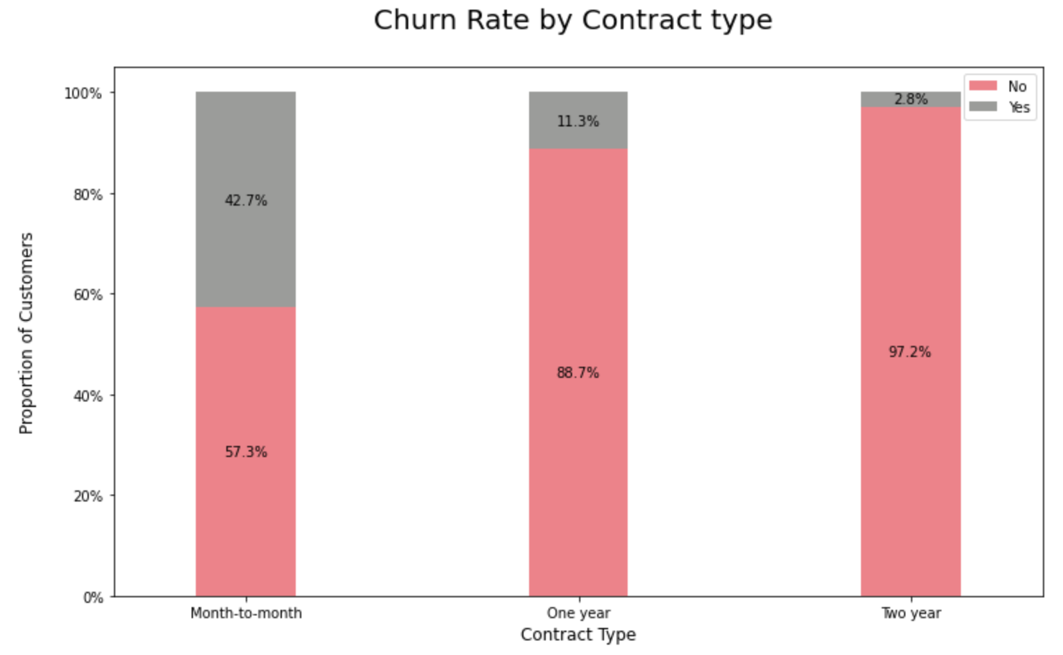
9.3.2. Churn Rate by Contract Type:
Customers with a prepaid or rather a month-to-month connection have a very high probability to churn compared to their peers on 1 or 2 years contracts.
import matplotlib.ticker as mtick
contract_churn =
dataset.groupby(
['Contract','Churn']).size().unstack()
contract_churn.rename(
columns={0:'No', 1:'Yes'}, inplace=True)
colors  = ['#ec838a','#9b9c9a']
ax = (contract_churn.T*100.0 /
contract_churn.T.sum()).
T.plot(kind='bar',
width = 0.3,stacked = True,rot = 0,
figsize = (12,7),color = colors)
plt.ylabel('Proportion of Customers\n',
horizontalalignment="center",fontstyle = "normal",
fontsize = "large", fontfamily = "sans-serif")
plt.xlabel('Contract Type\n',
horizontalalignment="center",
fontstyle = "normal",
fontsize = "large",
fontfamily = "sans-serif")
plt.title('Churn Rate by Contract type \n',
horizontalalignment="center", fontstyle = "normal",
fontsize = "22", fontfamily = "sans-serif")
plt.legend(loc='top right', fontsize = "medium")
plt.xticks(rotation=0,
horizontalalignment="center")
plt.yticks(rotation=0,
horizontalalignment="right")
ax.yaxis.set_major_formatter(mtick.PercentFormatter())
for p in ax.patches:
    width, height = p.get_width(),
    p.get_height()
    x, y = p.get_xy()
    ax.text(x+width/2,
            y+height/2,
            '{:.1f}%'.format(height),
            horizontalalignment='center',
            verticalalignment='center')
ax.autoscale(enable=False, axis='both', tight=False)
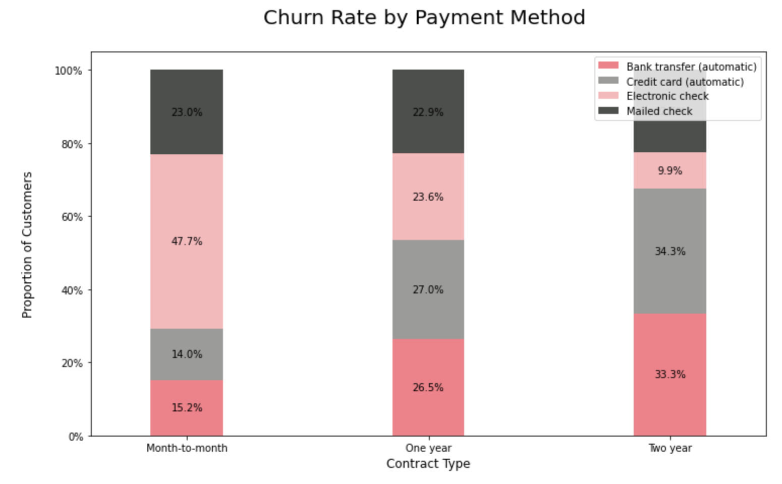
9.3.3. Churn Rate by Payment Method Type:
Customers who pay via bank transfers seem to have the lowest churn rate among all the payment method segments.
import matplotlib.ticker as mtick
contract_churn = dataset.groupby(['Contract',
'PaymentMethod']).size().unstack()
contract_churn.rename(columns=
{0:'No', 1:'Yes'}, inplace=True)
colors  = ['#ec838a','#9b9c9a',
'#f3babc' , '#4d4f4c']
ax = (contract_churn.T*100.0 /
contract_churn.T.sum()).T.plot(
kind='bar',width = 0.3,stacked = True,
rot = 0,figsize = (12,7),
color = colors)
plt.ylabel('Proportion of Customers\n',
horizontalalignment="center",
fontstyle = "normal",
fontsize = "large",
fontfamily = "sans-serif")
plt.xlabel('Contract Type\n',
horizontalalignment="center",
fontstyle = "normal", fontsize = "large",
fontfamily = "sans-serif")
plt.title('Churn Rate by Payment Method \n',
horizontalalignment="center",
fontstyle = "normal",
fontsize = "22", fontfamily = "sans-serif")
plt.legend(loc='top right', fontsize = "medium")
plt.xticks(rotation=0,
horizontalalignment="center")
plt.yticks(rotation=0,
horizontalalignment="right")
ax.yaxis.set_major_formatter(
mtick.PercentFormatter())
for p in ax.patches:
    width, height = p.get_width(),
    p.get_height()
    x, y = p.get_xy()
    ax.text(x+width/2,
            y+height/2,
            '{:.1f}%'.format(height),
            horizontalalignment='center',
            verticalalignment='center')
ax.autoscale(enable=False, axis='both', tight=False
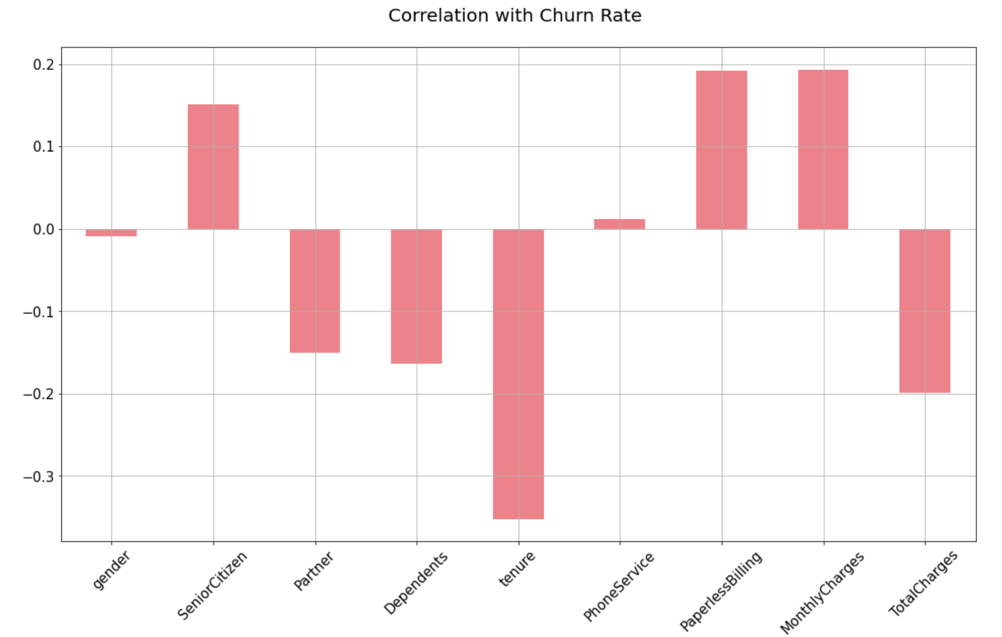
Step 9.4. Find positive and negative correlations:
Interestingly, the churn rate increases with monthly charges and age. In contrast Partner, Dependents and Tenure seem to be negatively related to churn. Let’s have a look into the positive and negative correlations graphically in the next step.
dataset2 = dataset[['SeniorCitizen',
          'Partner', 'Dependents',
       'tenure', 'PhoneService',
        'PaperlessBilling',
        'MonthlyCharges', 'TotalCharges']]
correlations = dataset2.corrwith(dataset.Churn)
correlations = correlations[
correlations!=1]
positive_correlations = correlations[
correlations >0].sort_values(ascending = False)
negative_correlations =correlations[
correlations<0].sort_values(ascending = False)
print('Most Positive Correlations: \n',
positive_correlations)
print('\nMost Negative Correlations: \n',
negative_correlations)
Step 9.5. Plot positive & negative correlations:
correlations = dataset2.corrwith(dataset.Churn)
correlations = correlations[correlations!=1]
correlations.plot.bar(
        figsize = (18, 10),
        fontsize = 15,
        color = '#ec838a',
        rot = 45, grid = True)
plt.title('Correlation with Churn Rate \n',
horizontalalignment="center",
fontstyle = "normal",
fontsize = "22",
fontfamily = "sans-serif")
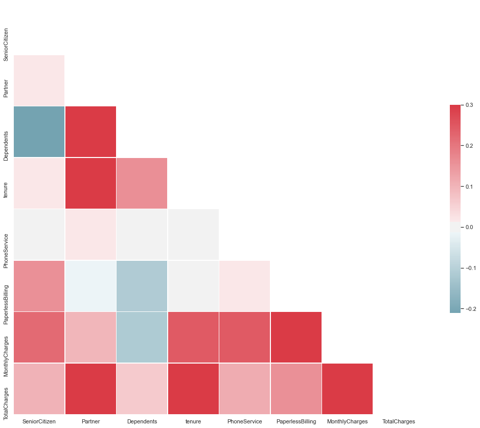
Step 9.6. Plot Correlation Matrix of all independent variables:
Correlation matrix helps us to discover the bivariate relationship between independent variables in a dataset.
#Set and compute the Correlation Matrix:

sn.set(style="white")
corr = dataset2.corr()
#Generate a mask for the upper triangle:
mask = np.zeros_like(corr, dtype=np.bool)
mask[np.triu_indices_from(mask)] = True
#Set up the matplotlib figure and a diverging colormap:
f, ax = plt.subplots(figsize=(18, 15))
cmap = sn.diverging_palette(220, 10, as_cmap=True)
#Draw the heatmap with the mask and correct aspect ratio:
sn.heatmap(corr, mask=mask, cmap=cmap, vmax=.3, center=0,
square=True, linewidths=.5, cbar_kws={"shrink": .5})
Step 9.7: Check Multicollinearity using VIF:
Let’s try to look into multicollinearity using Variable Inflation Factors (VIF). Unlike Correlation matrix, VIF determines the strength of the correlation of a variable with a group of other independent variables in a dataset. VIF starts usually at 1 and anywhere exceeding 10 indicates high multicollinearity between the independent variables.
def calc_vif(X):
# Calculating VIF
    vif = pd.DataFrame()
    vif["variables"] = X.columns
    vif["VIF"] = [
    variance_inflation_factor(
    X.values, i)
    for i in range(X.shape[1])]
return(vif)
dataset2 = dataset[['gender',
'SeniorCitizen', 'Partner', 'Dependents',
'tenure', 'PhoneService',
'PaperlessBilling','MonthlyCharges',
'TotalCharges']]
calc_vif(dataset2)
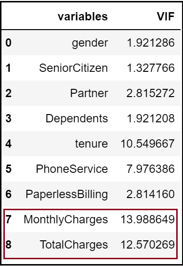
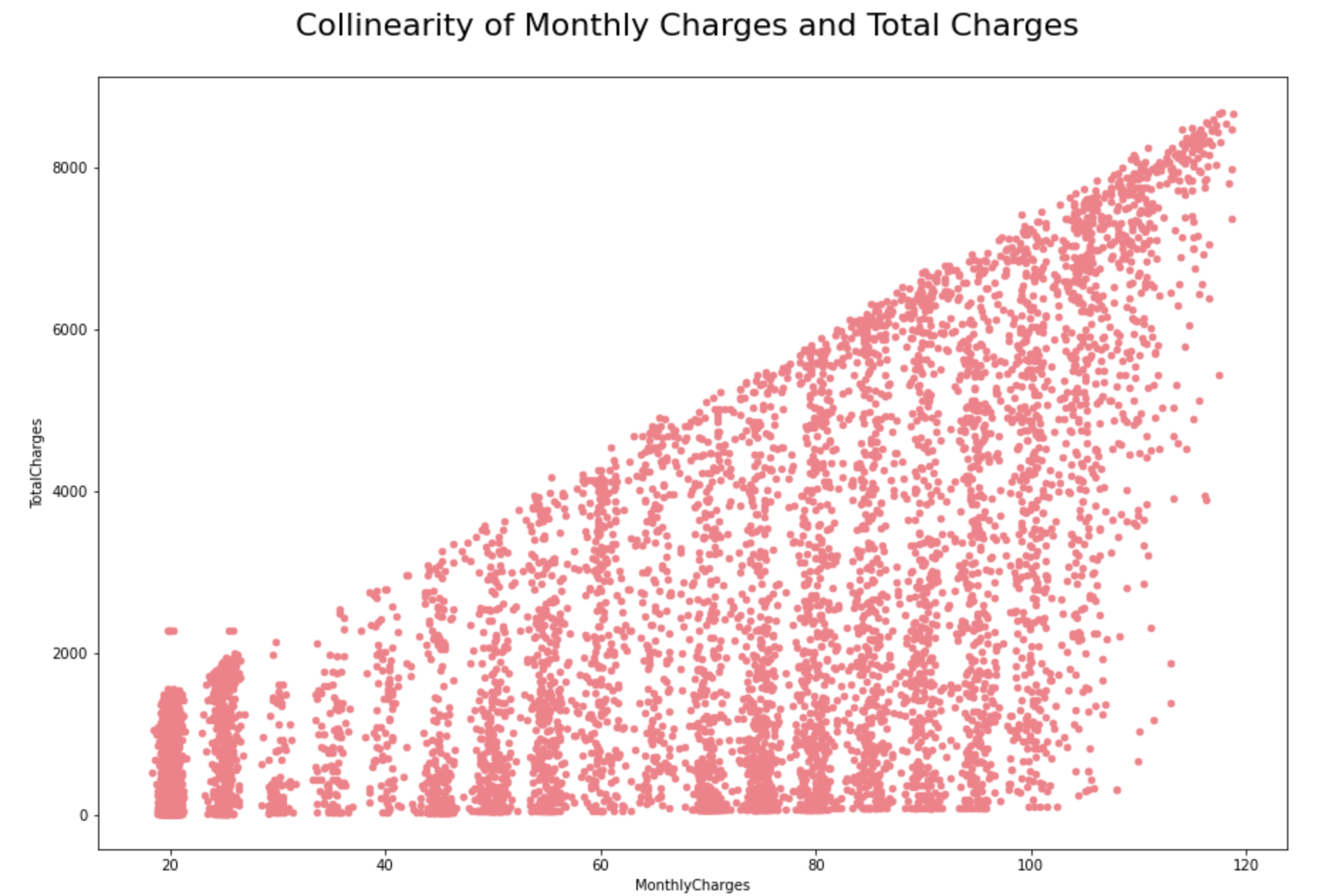
We can see here that the ‘Monthly Charges’ and ‘Total Charges’ have a high VIF value.
'Total Charges' seem to be collinear
with 'Monthly Charges'.

#Check colinearity:

dataset2[['MonthlyCharges',
'TotalCharges']].
plot.scatter(
figsize = (15, 10),
x ='MonthlyCharges',
y='TotalCharges',
color =  '#ec838a')
plt.title('Collinearity of Monthly
Charges and Total Charges \n',
horizontalalignment="center",
fontstyle = "normal", fontsize = "22",
fontfamily = "sans-serif")
Let’s try to drop one of the correlated features to see if it help us in bringing down the multicollinearity between correlated features:
#Dropping 'TotalCharges':

dataset2 = dataset2.drop(columns = "TotalCharges")
#Revalidate Colinearity:
dataset2 = dataset[['gender',
'SeniorCitizen', 'Partner', 'Dependents',
'tenure', 'PhoneService', 'PaperlessBilling',
'MonthlyCharges']]
calc_vif(dataset2)
#Applying changes in the main dataset:

dataset = dataset.drop(columns = "TotalCharges")
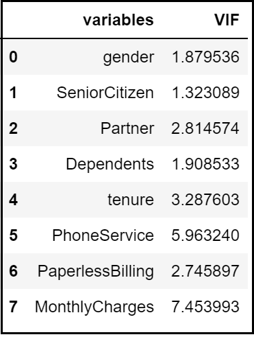
In our example, after dropping the ‘Total Charges’ variable, VIF values for all the independent variables have decreased to a considerable extent.
Exploratory Data Analysis Concluding Remarks:
Let’s try to summarise some of the key findings from this EDA:
1) The dataset does not have any missing or erroneous data values. Strongest positive correlation with the target features is Monthly Charges and Age whilst negative correlation is with Partner, Dependents and Tenure.
2) The dataset is imbalanced with the majority of customers being active. There is multicollinearity between Monthly Charges and Total Charges. Dropping Total Charges have decreased the VIF values considerably.
3) Most of the customers in the dataset are younger people.
4) There are a lot of new customers in the organization (less than 10 months old) followed by a loyal customer base that’s above 70 months old. Most of the customers seem to have phone service with Monthly charges spanning between $18 to $118 per customer.
5) Customers with a month-to-month connection have a very high probability to churn that too if they have subscribed to pay via electronic checks.
Step 10: Encode Categorical data:
Any categorical variable that has more than two unique values have been dealt with Label Encoding and one-hot Encoding using get_dummies method in pandas here.
#Incase if user_id is an object:

identity = dataset["customerID"]
dataset = dataset.drop(columns="customerID")

#Convert rest of categorical variable into dummy:

dataset= pd.get_dummies(dataset)

#Rejoin userid to dataset:
dataset = pd.concat([dataset, identity], axis = 1)
Step 11: Split the dataset into dependent and independent variables:
Now we need to separate the dataset into X and y values. y would be the ‘Churn’ column whilst X would be the remaining list of independent variables in the dataset.
#Identify response variable:

response = dataset["Churn"]
dataset = dataset.drop(columns="Churn")
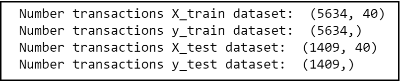
Step 12: Generate training and test datasets:
Let’s decouple the master dataset into training and test set with an 80%-20% ratio.
X_train, X_test, y_train, y_test =
train_test_split(dataset,
response,stratify=response, test_size = 0.2,
#use 0.9 if data is huge.random_state = 0)
#to resolve any class imbalance -
use stratify parameter.
print("Number transactions X_train dataset:
", X_train.shape)
print("Number transactions y_train dataset:
", y_train.shape)
print("Number transactions X_test dataset:
", X_test.shape)
print("Number transactions y_test dataset:
", y_test.shape)
Step 13: Remove Identifiers:
Separate ‘customerID’ from training and test data frames.
train_identity = X_train['customerID']
X_train = X_train.drop(columns = ['customerID'])

test_identity = X_test['customerID']
X_test = X_test.drop(columns = ['customerID'])
Step 14: Conduct Feature Scaling:
It’s quite important to normalize the variables before conducting any machine learning (classification) algorithms so that all the training and test variables are scaled within a range of 0 to 1.
sc_X = StandardScaler()
X_train2 = pd.DataFrame(sc_X.fit_transform(X_train))
X_train2.columns = X_train.columns.values
X_train2.index = X_train.index.values
X_train = X_train2
X_test2 = pd.DataFrame(sc_X.transform(X_test))
X_test2.columns = X_test.columns.values
X_test2.index = X_test.index.values
X_test = X_test2
Section C: Model Selection
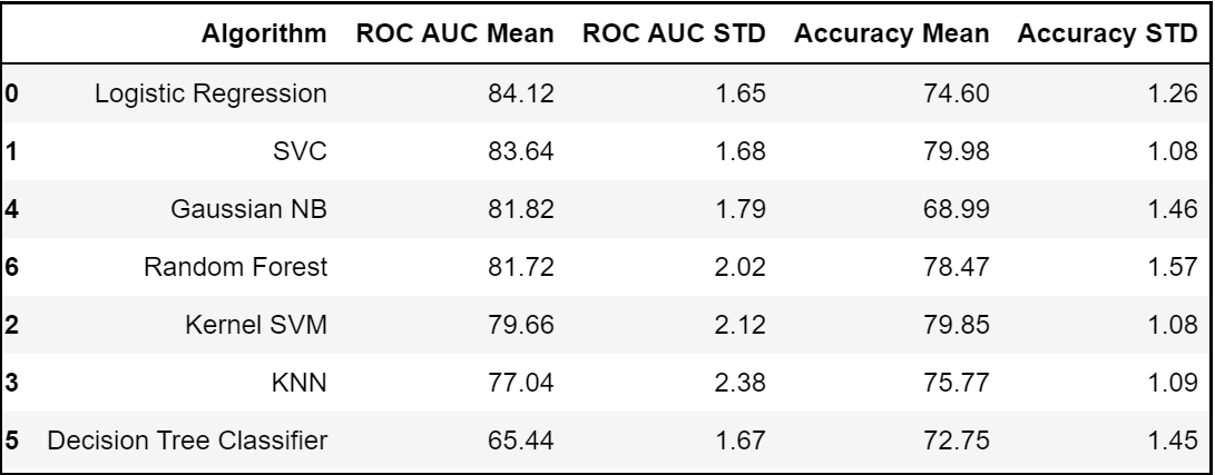
Step 15.1: Compare Baseline Classification Algorithms (1st Iteration):
Let’s model each classification algorithm over the training dataset and evaluate their accuracy and standard deviation scores. Classification Accuracy is one of the most common classification evaluation metrics to compare baseline algorithms as its the number of correct predictions made as a ratio of total predictions. However, it’s not the ideal metric when we have class imbalance issue. Hence, let us sort the results based on the ‘Mean AUC’ value which is nothing but the model’s ability to discriminate between positive and negative classes.
models = []
models.append(('Logistic Regression',
LogisticRegression(
solver='liblinear',
random_state = 0,
class_weight='balanced')))
models.append(('SVC', SVC(kernel = 'linear',
random_state = 0)))
models.append(('Kernel SVM',
SVC(kernel = 'rbf', random_state = 0)))
models.append(('KNN',
KNeighborsClassifier(n_neighbors = 5,
metric = 'minkowski', p = 2)))
models.append(('Gaussian NB',
GaussianNB()))
models.append(('Decision Tree Classifier',
DecisionTreeClassifier(
criterion = 'entropy', random_state = 0)))
models.append(('Random Forest',
RandomForestClassifier(
n_estimators=100,
criterion = 'entropy',
random_state = 0)))

#Evaluating Model Results:
acc_results = []
auc_results = []
names = []
# set table to table to populate
with performance results
col = ['Algorithm', 'ROC AUC Mean',
'ROC AUC STD',
'Accuracy Mean',
'Accuracy STD']
model_results = pd.DataFrame(columns=col)
i = 0

# Evaluate each model using k-fold cross-validation:
for name, model in models:
    kfold = model_selection.KFold(
        n_splits=10, random_state=0)
# accuracy scoring:
cv_acc_results = model_selection.cross_val_score(
model, X_train, y_train, cv=kfold,
scoring='accuracy')

# roc_auc scoring:
cv_auc_results = model_selection.cross_val_score(
model, X_train, y_train, cv=kfold,
scoring='roc_auc')

acc_results.append(cv_acc_results)
    auc_results.append(cv_auc_results)
    names.append(name)
    model_results.loc[i] =
    [name,
    round(cv_auc_results.mean()*100, 2),
    round(cv_auc_results.std()*100, 2),
    round(cv_acc_results.mean()*100, 2),
    round(cv_acc_results.std()*100, 2)
    ]
    i += 1

model_results.sort_values(
by=['ROC AUC Mean'], ascending=False)
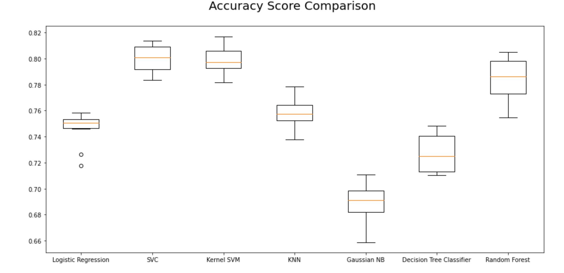
Step 15.2. Visualize Classification Algorithms Accuracy Comparisons:
Using Accuracy Mean:
fig = plt.figure(figsize=(15, 7))
ax = fig.add_subplot(111)
plt.boxplot(acc_results)
ax.set_xticklabels(names)
#plt.ylabel('ROC AUC Score\n',
horizontalalignment="center",fontstyle = "normal",
fontsize = "large", fontfamily = "sans-serif")
#plt.xlabel('\n Baseline Classification Algorithms\n',
horizontalalignment="center",fontstyle = "normal",
fontsize = "large", fontfamily = "sans-serif")
plt.title('Accuracy Score Comparison \n',
horizontalalignment="center", fontstyle = "normal",
fontsize = "22", fontfamily = "sans-serif")
#plt.legend(loc='top right', fontsize = "medium")
plt.xticks(rotation=0, horizontalalignment="center")
plt.yticks(rotation=0, horizontalalignment="right")
plt.show()
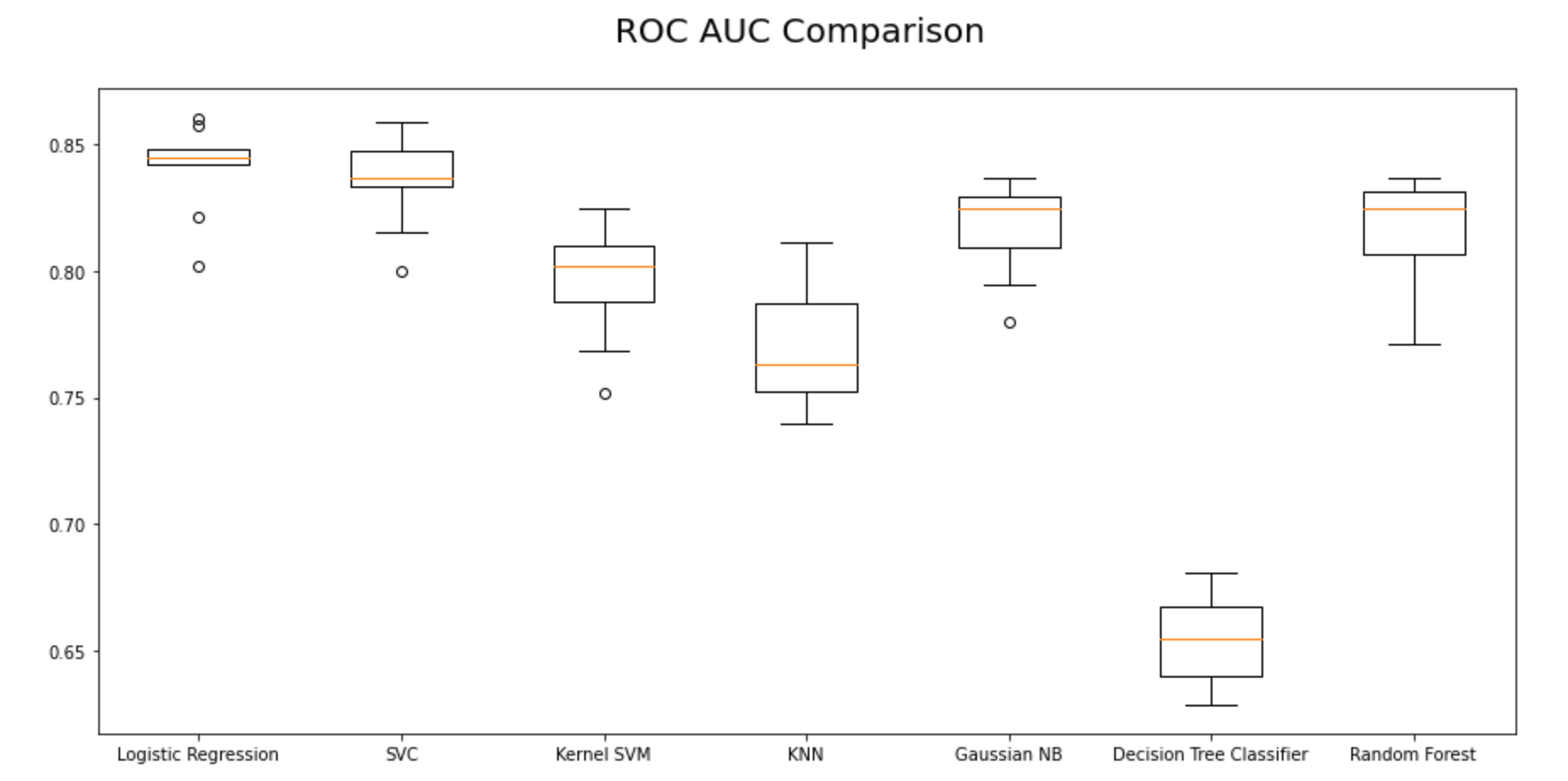
Using Area under ROC Curve:
From the first iteration of baseline classification algorithms, we can see that Logistic Regression and SVC have outperformed the other five models for the chosen dataset with the highest mean AUC Scores. Let’s reconfirm our results in the second iteration as shown in the next steps.
fig = plt.figure(figsize=(15, 7))
ax = fig.add_subplot(111)
plt.boxplot(auc_results)
ax.set_xticklabels(names)
#plt.ylabel('ROC AUC Score\n',
horizontalalignment="center",fontstyle = "normal",
fontsize = "large", fontfamily = "sans-serif")
#plt.xlabel('\n Baseline Classification Algorithms\n',
horizontalalignment="center",fontstyle = "normal",
fontsize = "large", fontfamily = "sans-serif")
plt.title('ROC AUC Comparison \n',
horizontalalignment="center",
fontstyle = "normal", fontsize = "22",
fontfamily = "sans-serif")
#plt.legend(loc='top right', fontsize = "medium")
plt.xticks(rotation=0, horizontalalignment="center")
plt.yticks(rotation=0, horizontalalignment="right")
plt.show()
Step 15.3. Get the right parameters for the baseline models:
Before doing the second iteration, let’s optimize the parameters and finalize the evaluation metrics for model selection.
Identify the optimal number of K neighbors for KNN Model:
In the first iteration, we assumed that K = 3, but in reality, we don’t know what is the optimal K value that gives maximum accuracy for the chosen training dataset. Therefore, let us write a for loop that iterates 20 to 30 times and gives the accuracy at each iteration so as to figure out the optimal number of K neighbors for the KNN Model.
score_array = []
for each in range(1,25):
    knn_loop = KNeighborsClassifier(n_neighbors = each)

#set K neighbor as 3
    knn_loop.fit(X_train,y_train)
    score_array.append(knn_loop.score(X_test,y_test))
fig = plt.figure(figsize=(15, 7))
plt.plot(range(1,25),score_array, color = '#ec838a')
plt.ylabel('Range\n',horizontalalignment="center",
fontstyle = "normal", fontsize = "large",
fontfamily = "sans-serif")
plt.xlabel('Score\n',horizontalalignment="center",
fontstyle = "normal", fontsize = "large",
fontfamily = "sans-serif")
plt.title('Optimal Number of K Neighbors \n',
horizontalalignment="center", fontstyle = "normal",
 fontsize = "22", fontfamily = "sans-serif")

#plt.legend(loc='top right', fontsize = "medium")
plt.xticks(rotation=0, horizontalalignment="center")
plt.yticks(rotation=0, horizontalalignment="right")
plt.show()
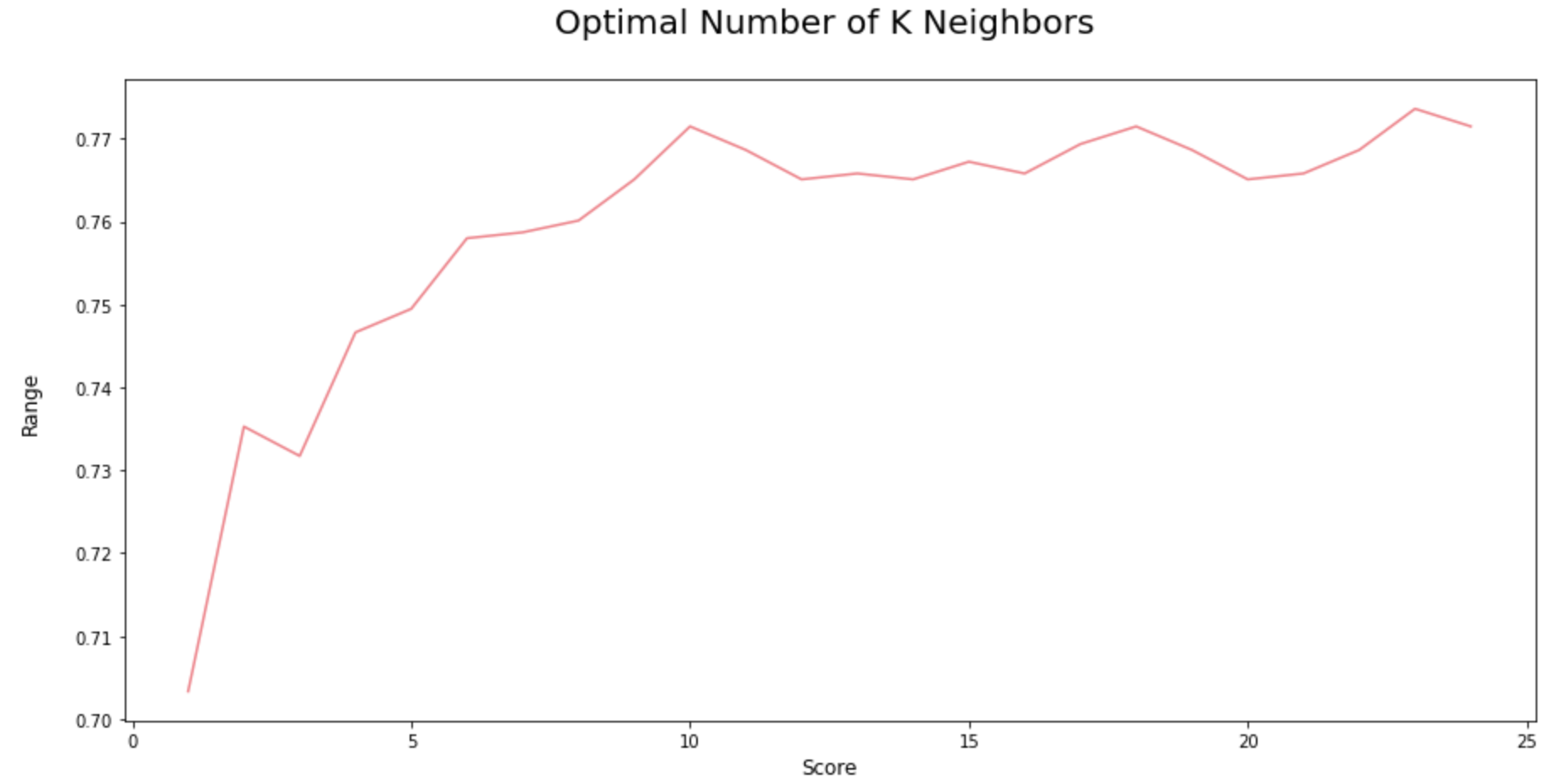
As we can see from the above iterations, if we use K = 22, then we will get the maximum score of 78%.
Identify the optimal number of trees for Random Forest Model: Quite similar to the iterations in the KNN model, here we are trying to find the optimal number of decision trees to compose the best random forest.
score_array = []
for each in range(1,100):
    rf_loop = RandomForestClassifier(
n_estimators = each, random_state = 1)
    rf_loop.fit(X_train,y_train)
    score_array.append(rf_loop.score
    (X_test,y_test))
fig = plt.figure(figsize=(15, 7))
plt.plot(range(1,100),
score_array, color = '#ec838a')
plt.ylabel('Range\n',
horizontalalignment="center",
fontstyle = "normal",
fontsize = "large",
fontfamily = "sans-serif")
plt.xlabel('Score\n',
horizontalalignment="center",
fontstyle = "normal", fontsize = "large",
fontfamily = "sans-serif")
plt.title('Optimal Number of Trees
for Random Forest Model \n',
horizontalalignment="center",
fontstyle = "normal", fontsize = "22",
fontfamily = "sans-serif")
#plt.legend(loc='top right', fontsize = "medium")
plt.xticks(rotation=0,
horizontalalignment="center")
plt.yticks(rotation=0,
horizontalalignment="right")
plt.show()
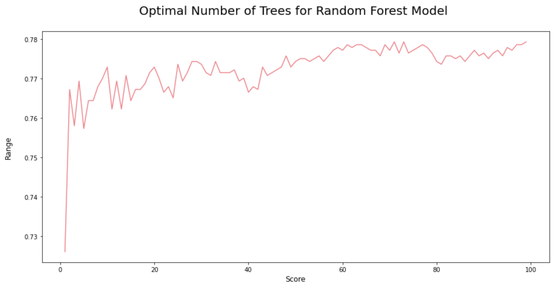
As we could see from the iterations above, the random forest model would attain the highest accuracy score when its n_estimators = 72.
Step 15.4. Compare Baseline Classification Algorithms (2nd Iteration):
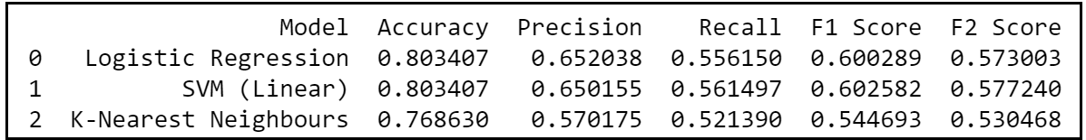
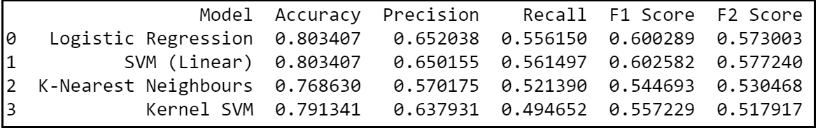
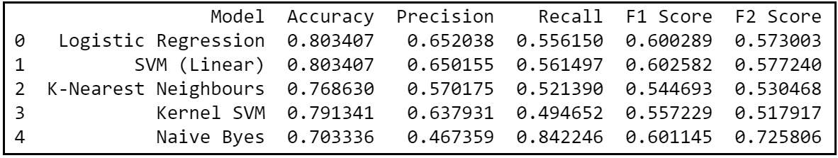
In the second iteration of comparing baseline classification algorithms, we would be using the optimised parameters for KNN and Random Forest models. Also, we know that false negatives are more costly than false positives in a churn and hence let’s use precision, recall and F2 scores as the ideal metric for the model selection.
Step 15.4.1. Logistic Regression:
# Fitting Logistic Regression to the Training set

classifier = LogisticRegression(random_state = 0)
classifier.fit(X_train, y_train)
# Predicting the Test set results
y_pred = classifier.predict(X_test)

#Evaluate results

acc = accuracy_score(y_test, y_pred )
prec = precision_score(y_test, y_pred )
rec = recall_score(y_test, y_pred )
f1 = f1_score(y_test, y_pred )
f2 = fbeta_score(y_test, y_pred, beta=2.0)
results = pd.DataFrame([['Logistic Regression',
acc, prec, rec, f1, f2]], columns = ['Model',
'Accuracy', 'Precision', 'Recall', 'F1 Score',
'F2 Score'])
results = results.sort_values(["Precision",
"Recall", "F2 Score"], ascending = False)
print (results)

Step 15.4.2. Support Vector Machine (linear classifier):
# Fitting SVM (SVC class) to the Training set

classifier = SVC(kernel = 'linear', random_state = 0)
classifier.fit(X_train, y_train)

# Predicting the
Test set results y_pred =
classifier.predict(X_test)

#Evaluate results

acc = accuracy_score(y_test, y_pred )
prec = precision_score(y_test, y_pred )
rec = recall_score(y_test, y_pred)
f1 = f1_score(y_test, y_pred )
f2 = fbeta_score(y_test, y_pred, beta=2.0)
model_results = pd.DataFrame(
[['SVM (Linear)', acc, prec, rec, f1, f2]],
columns = ['Model', 'Accuracy', 'Precision',
'Recall', 'F1 Score', 'F2 Score'])
results = results.append(model_results,
ignore_index = True)
results = results.sort_values(["Precision",
"Recall", "F2 Score"], ascending = False)
print (results)

Step 15.4.3. K-Nearest Neighbors:
# Fitting KNN to the Training set:

classifier = KNeighborsClassifier(
n_neighbors = 22,
metric = 'minkowski', p = 2)
classifier.fit(X_train, y_train)
# Predicting the Test set results
y_pred  = classifier.predict(X_test)

#Evaluate results

acc = accuracy_score(y_test, y_pred )
prec = precision_score(y_test, y_pred )
rec = recall_score(y_test, y_pred )
f1 = f1_score(y_test, y_pred )
f2 = fbeta_score(y_test, y_pred, beta=2.0)
model_results = pd.DataFrame([[
'K-Nearest Neighbours',
acc, prec, rec, f1, f2]], columns = ['Model',
 'Accuracy', 'Precision', 'Recall',
 'F1 Score', 'F2 Score'])
results = results.append(model_results,
ignore_index = True)
results = results.sort_values(["Precision",
"Recall", "F2 Score"], ascending = False)
print (results)
Step 15.4.4. Kernel SVM:
# Fitting Kernel SVM to the Training set:
classifier = SVC(kernel = 'rbf', random_state = 0)
classifier.fit(X_train, y_train)
# Predicting the Test set results
y_pred = classifier.predict(X_test)
#Evaluate results
acc = accuracy_score(y_test, y_pred )
prec = precision_score(y_test, y_pred )
rec = recall_score(y_test, y_pred )
f1 = f1_score(y_test, y_pred )
f2 = fbeta_score(y_test, y_pred, beta=2.0)
model_results = pd.DataFrame([[
'Kernel SVM', acc, prec, rec, f1, f2]],
columns = ['Model', 'Accuracy', 'Precision',
'Recall', 'F1 Score', 'F2 Score'])
results = results.append(model_results,
ignore_index = True)
results = results.sort_values(["Precision",
"Recall", "F2 Score"], ascending = False)
print (results)
Step 15.4.5. Naive Byes:
# Fitting Naive Byes to the Training set:

classifier = GaussianNB()
classifier.fit(X_train, y_train)
# Predicting the Test set results
y_pred = classifier.predict(X_test)

#Evaluate results

acc = accuracy_score(y_test, y_pred )
prec = precision_score(y_test, y_pred )
rec = recall_score(y_test, y_pred )
f1 = f1_score(y_test, y_pred )
f2 = fbeta_score(y_test, y_pred, beta=2.0)
model_results = pd.DataFrame([[
'Naive Byes', acc, prec, rec, f1, f2]],
columns = ['Model', 'Accuracy', 'Precision',
'Recall', 'F1 Score', 'F2 Score'])
results = results.append(model_results,
ignore_index = True)
results = results.sort_values(["Precision",
"Recall", "F2 Score"], ascending = False)
print (results)
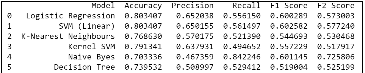
Step 15.4.6. Decision Tree:
# Fitting Decision Tree to the Training set:
classifier = DecisionTreeClassifier(
criterion = 'entropy', random_state = 0)
classifier.fit(X_train, y_train)
# Predicting the Test set results
y_pred = classifier.predict(X_test)
#Evaluate results
acc = accuracy_score(y_test, y_pred )
prec = precision_score(y_test, y_pred )
rec = recall_score(y_test, y_pred )
f1 = f1_score(y_test, y_pred )
f2 = fbeta_score(y_test, y_pred, beta=2.0)
model_results = pd.DataFrame([[
'Decision Tree', acc, prec, rec, f1, f2]],
 columns = ['Model', 'Accuracy', 'Precision',
'Recall', 'F1 Score', 'F2 Score'])
results = results.append(model_results,
ignore_index = True)
results = results.sort_values(["Precision",
"Recall", "F2 Score"], ascending = False)
print (results)
Step 15.4.7. Random Forest:
# Fitting Random Forest to the Training set:

classifier = RandomForestClassifier(n_estimators = 72,
criterion = 'entropy', random_state = 0)
classifier.fit(X_train, y_train)
# Predicting the Test set results
y_pred = classifier.predict(X_test)

#Evaluate results

from sklearn.metrics
import confusion_matrix,
accuracy_score, f1_score, precision_score,
recall_score
acc = accuracy_score(y_test, y_pred )
prec = precision_score(y_test, y_pred )
rec = recall_score(y_test, y_pred )
f1 = f1_score(y_test, y_pred )
f2 = fbeta_score(y_test, y_pred, beta=2.0)
model_results = pd.DataFrame([['Random Forest',
acc, prec, rec, f1, f2]],
columns = ['Model', 'Accuracy', 'Precision',
'Recall', 'F1 Score', 'F2 Score'])
results = results.append(model_results,
ignore_index = True)
results = results.sort_values(["Precision",
"Recall", "F2 Score"], ascending = False)
print (results)
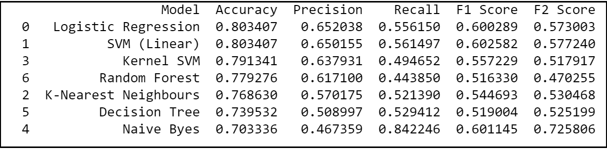
From the 2nd iteration, we can definitely conclude that logistic regression is an optimal model of choice for the given dataset as it has relatively the highest combination of precision, recall and F2 scores; giving most number of correct positive predictions while minimizing the false negatives. Hence, let’s try to use Logistic Regression and evaluate its performance in the forthcoming sections.
Section D: Model Evaluation:
Step 16: Train & evaluate Chosen Model:
Let’s fit the selected model (Logistic Regression in this case) on the training dataset and evaluate the results.
classifier = LogisticRegression(random_state = 0,
penalty = 'l2')
classifier.fit(X_train, y_train)
# Predict the Test set results
y_pred = classifier.predict(X_test)
#Evaluate Model Results on Test Set:
acc = accuracy_score(y_test, y_pred )
prec = precision_score(y_test, y_pred )
rec = recall_score(y_test, y_pred )
f1 = f1_score(y_test, y_pred )
f2 = fbeta_score(y_test, y_pred, beta=2.0)
results = pd.DataFrame([['Logistic Regression',
acc, prec, rec, f1, f2]],columns =
['Model', 'Accuracy', 'Precision',
'Recall', 'F1 Score', 'F2 Score'])
print (results)
k-Fold Cross-Validation:
Model evaluation is most commonly done through ‘K- fold Cross-Validation’ technique that primarily helps us to fix the variance. Variance problem occurs when we get good accuracy while running the model on a training set and a test set but then the accuracy looks different when the model is run on another test set.
So, in order to fix the variance problem, k-fold cross-validation basically split the training set into 10 folds and train the model on 9 folds (9 subsets of the training dataset) before testing it on the test fold. This gives us the flexibility to train our model on all ten combinations of 9 folds; giving ample room to finalize the variance.
accuracies = cross_val_score(estimator = classifier,
 X = X_train, y = y_train, cv = 10)
print("Logistic Regression Classifier Accuracy:
%0.2f (+/- %0.2f)"  % (accuracies.mean(),
accuracies.std() * 2))

Therefore, our k-fold Cross Validation results indicate that we would have an accuracy anywhere between 76% to 84% while running this model on any test set.
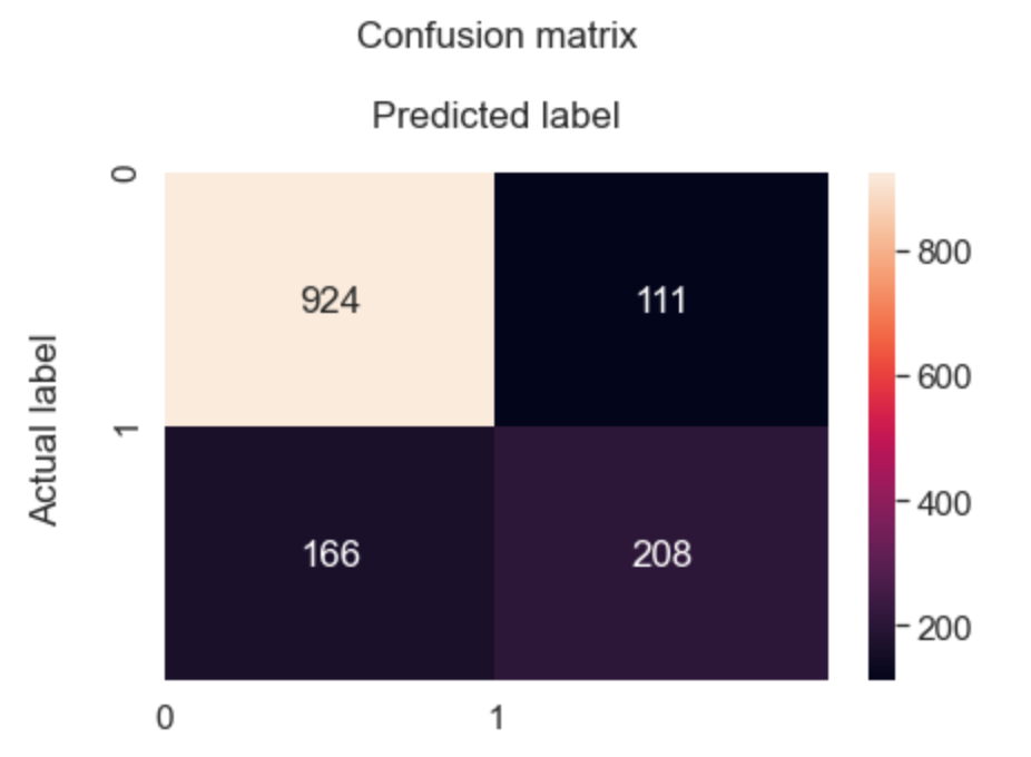
Visualize results on a Confusion Matrix:
The Confusion matrix indicates that we have 208+924 correct predictions and 166+111 incorrect predictions.
Accuracy rate = number of correct predictions/ total predictions Error rate = Number of wrong predictions / total predictions
We have got an accuracy of 80%; signalling the characteristics of a reasonably good model.
cm = confusion_matrix(y_test, y_pred)
df_cm = pd.DataFrame(cm, index = (0, 1),
columns = (0, 1))
plt.figure(figsize = (28,20))
fig, ax = plt.subplots()
sn.set(font_scale=1.4)
sn.heatmap(df_cm, annot=True,
fmt='g'#,cmap="YlGnBu"
           )
class_names=[0,1]
tick_marks = np.arange(len(class_names))
plt.tight_layout()
plt.title('Confusion matrix\n', y=1.1)
plt.xticks(tick_marks, class_names)
plt.yticks(tick_marks, class_names)
ax.xaxis.set_label_position("top")
plt.ylabel('Actual label\n')
plt.xlabel('Predicted label\n')

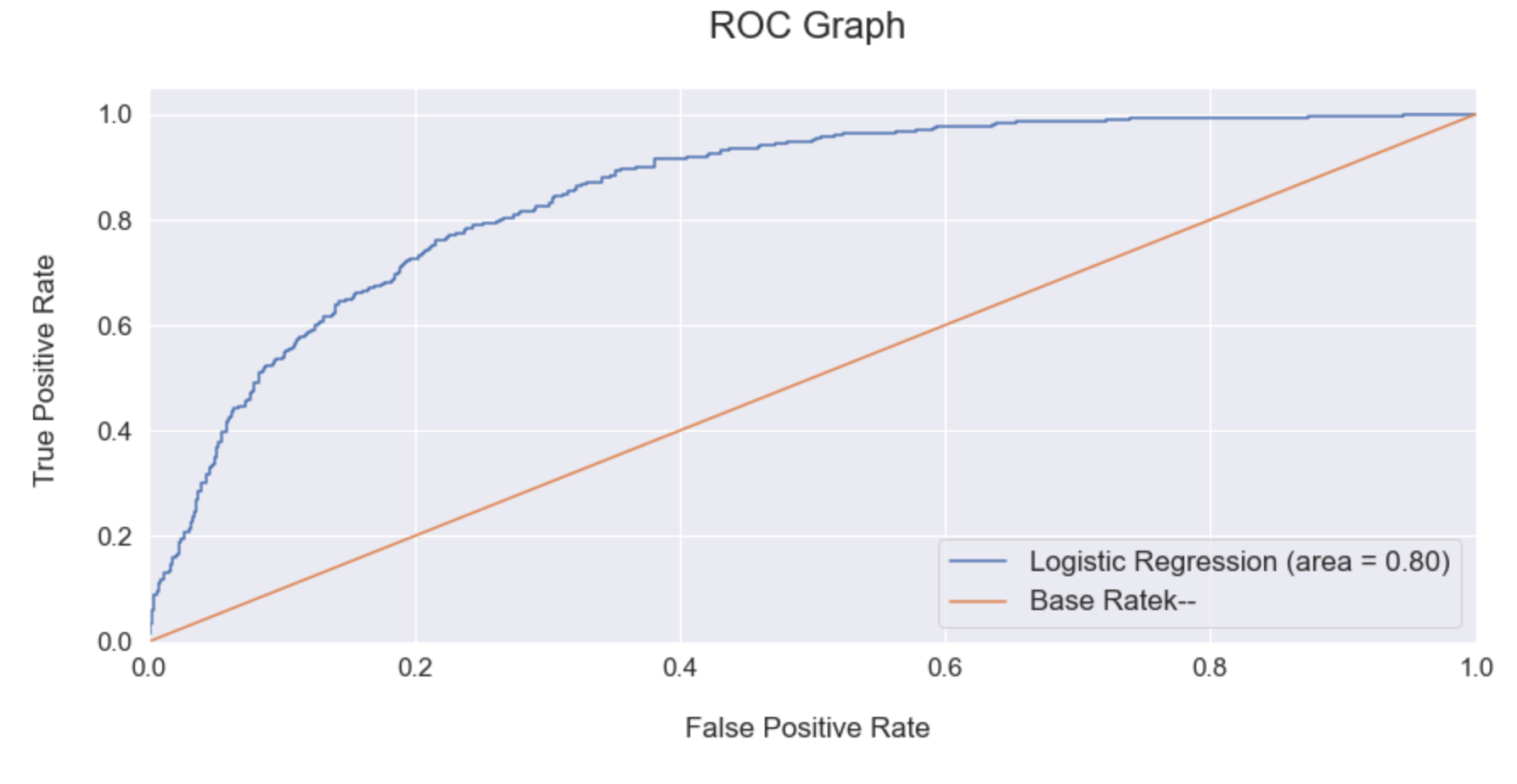
Evaluate the model using ROC Graph:
It’s good to re-evaluate the model using ROC Graph. ROC Graph shows us the capability of a model to distinguish between the classes based on the AUC Mean score. The orange line represents the ROC curve of a random classifier while a good classifier tries to remain as far away from that line as possible. As shown in the graph below, the fine-tuned Logistic Regression model showcased a higher AUC score.
classifier.fit(X_train, y_train)
probs = classifier.predict_proba(X_test)
probs = probs[:, 1]
classifier_roc_auc = accuracy_score(
y_test, y_pred )
rf_fpr, rf_tpr, rf_thresholds =
roc_curve(y_test,
classifier.predict_proba(X_test)[:,1])
plt.figure(figsize=(14, 6))
# Plot Logistic Regression ROC
plt.plot(rf_fpr, rf_tpr,
label='Logistic Regression (
area = %0.2f)' % classifier_roc_auc)
# Plot Base Rate ROC
plt.plot([0,1], [0,1],
label='Base Rate' 'k--')
plt.xlim([0.0, 1.0])
plt.ylim([0.0, 1.05])
plt.ylabel('True Positive Rate \n',
horizontalalignment="center",
fontstyle = "normal", fontsize = "medium",
fontfamily = "sans-serif")
plt.xlabel('\nFalse Positive Rate \n',
horizontalalignment="center",
fontstyle = "normal", fontsize = "medium",
fontfamily = "sans-serif")
plt.title('ROC Graph \n',
horizontalalignment="center",
fontstyle = "normal", fontsize = "22",
fontfamily = "sans-serif")
plt.legend(loc="lower right", fontsize = "medium")
plt.xticks(rotation=0,
horizontalalignment="center")
plt.yticks(rotation=0,
horizontalalignment="right")
plt.show()
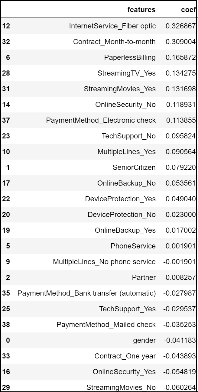
Step 17:Predict Feature Importance:
Logistic Regression allows us to determine the key features that have significance in predicting the target attribute (“Churn” in this project).
The logistic regression model predicts that the churn rate would increase positively with month to month contract, optic fibre internet service, electronic checks, absence of payment security and tech support.
On the other hand, the model predicts a negative correlation with churn if any customer has subscribed to online security, one-year contract or if they have opted for mailed checks as their payment medium.
# Analyzing Coefficients

feature_importances = pd.concat([
pd.DataFrame(dataset.drop(
columns = 'customerID').
columns, columns = [
"features"]),
pd.DataFrame(np.transpose(
classifier.coef_),
columns = ["coef"])],axis = 1)
feature_importances.sort_values(
"coef", ascending = False)
Section E: Model Improvement
Model improvement basically involves choosing the best parameters for the machine learning model that we have come up with. There are two types of parameters in any machine learning model — the first type are the kind of parameters that the model learns; the optimal values automatically found by running the model. The second type of parameters is the ones that user get to choose while running the model. Such parameters are called the hyperparameters; a set of configurable values external to a model that cannot be determined by the data, and that we are trying to optimize through Parameter Tuning techniques like Random Search or Grid Search.
Hyperparameter tuning might not improve the model every time. For instance, when we tried to tune the model further, we ended up getting an accuracy score lower than the default one. I’m just demonstrating the steps involved in hyperparameter tuning here for future references.
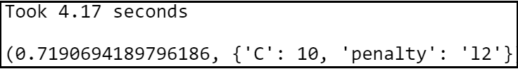
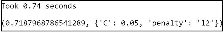
Step 18:Hyper parameter Tuning via Grid Search:
# Round 1:

# Select Regularization Method

import time
penalty = ['l1', 'l2']
# Create regularization hyperparameter space

C = [0.001, 0.01, 0.1, 1, 10, 100, 1000]
# Combine Parameters
parameters = dict(C=C, penalty=penalty)
lr_classifier = GridSearchCV(
estimator = classifier,
param_grid = parameters,
scoring = "balanced_accuracy",
cv = 10,
n_jobs = -1)

t0 = time.time()
lr_classifier  = lr_classifier .fit
(X_train, y_train)
t1 = time.time()
print("Took %0.2f seconds" %
(t1 - t0))
lr_best_accuracy = lr_classifier.best_score_
lr_best_parameters = lr_classifier.best_params_
lr_best_accuracy, lr_best_parameters
# Round 2:

# Select Regularization Method

import time
penalty = ['l2']
# Create regularization hyperparameter space

C = [ 0.0001, 0.001, 0.01, 0.02, 0.05]
# Combine Parameters
parameters = dict(C=C, penalty=penalty)
lr_classifier = GridSearchCV(
estimator = classifier,
param_grid = parameters,
scoring = "balanced_accuracy",
cv = 10,
n_jobs = -1)
t0 = time.time()
lr_classifier  = lr_classifier.fit(
X_train, y_train)
t1 = time.time()
print("Took %0.2f seconds" % (t1 - t0))
lr_best_accuracy = lr_classifier.best_score_
lr_best_parameters = lr_classifier.best_params_
lr_best_accuracy, lr_best_parameters
Step 18.2: Final Hyperparameter tuning and selection:
lr_classifier = LogisticRegression(
random_state = 0, penalty = 'l2')
lr_classifier.fit(
X_train, y_train)
# Predict the Test set results
y_pred = lr_classifier.predict(
X_test)
#probability score
y_pred_probs = lr_classifier.predict_proba(
X_test)
y_pred_probs  = y_pred_probs [:, 1]
Section F: Future Predictions
Step 19: Compare predictions against the test set:
#Revalidate final results with Confusion Matrix:
cm = confusion_matrix(y_test, y_pred)
print (cm)
#Confusion Matrix as a quick Crosstab:

pd.crosstab(y_test,pd.Series(y_pred),
rownames=['ACTUAL'],colnames=['PRED'])
#visualize Confusion Matrix:
cm = confusion_matrix(y_test, y_pred)
df_cm = pd.DataFrame(cm,
index = (0, 1),
columns = (0, 1))
plt.figure(figsize = (28,20))
fig, ax = plt.subplots()
sn.set(font_scale=1.4)
sn.heatmap(df_cm, annot=True,
fmt='g'#,cmap="YlGnBu"
           )
class_names=[0,1]
tick_marks = np.arange(len(
class_names))
plt.tight_layout()
plt.title('Confusion matrix\n', y=1.1)
plt.xticks(tick_marks,
class_names)
plt.yticks(tick_marks,
class_names)
ax.xaxis.set_label_position("top")
plt.ylabel('Actual label\n')
plt.xlabel('Predicted label\n')
print("Test Data Accuracy: %0.4f" % accuracy_score(
y_test, y_pred))
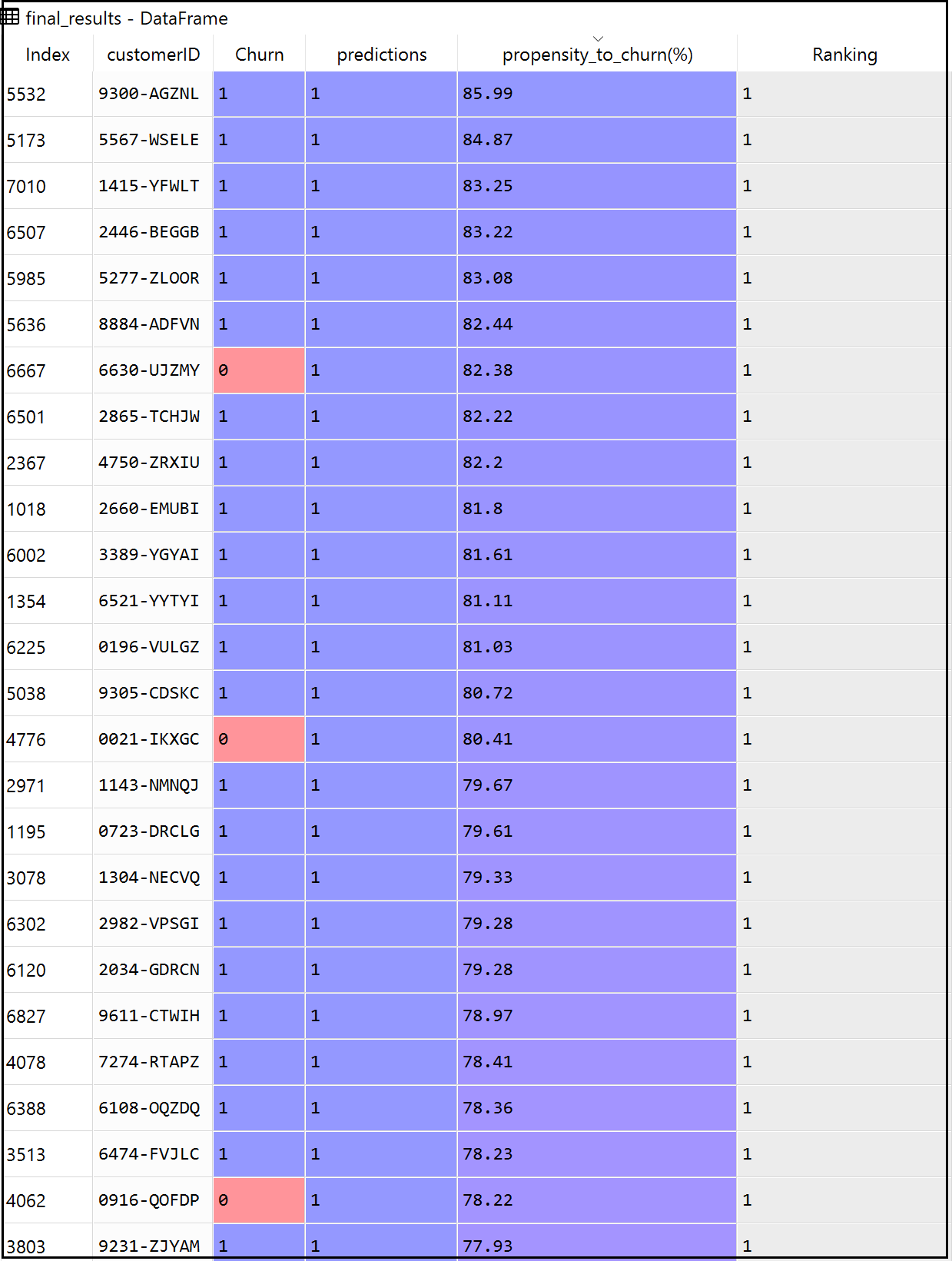
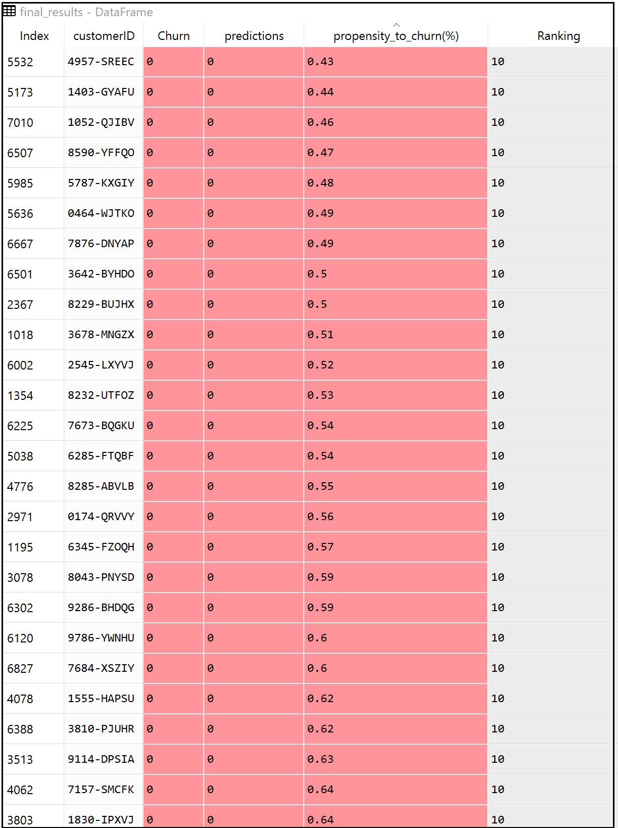
Step 20: Format Final Results:
Unpredictability and risk are the close companions of any predictive models. Therefore in the real world, its always a good practice to build a propensity score besides an absolute predicted outcome. Instead of just retrieving a binary estimated target outcome (0 or 1), every ‘Customer ID’ could get an additional layer of propensity score highlighting their percentage of probability to take the target action.
final_results = pd.concat([test_identity,
y_test], axis = 1).dropna()
final_results['predictions'] = y_pred
final_results["propensity_to_churn(%)"] =
y_pred_probs
final_results["propensity_to_churn(%)"] =
final_results["propensity_to_churn(%)"]*100
final_results["propensity_to_churn(%)"]=
final_results["propensity_to_churn(%)"].round(2)
final_results = final_results[['customerID', 'Churn',
'predictions', 'propensity_to_churn(%)']]
final_results ['Ranking'] = pd.qcut(final_results
propensity_to_churn(%)'].rank(method = 'first'),10,
labels=range(10,0,-1))
print (final_results)
Section G: Model Deployment
Lastly, deploy the model to a server using ‘joblib’ library so that we can productionize the end-to-end machine learning framework. Later we can run the model over any new dataset to predict the probability of any customer to churn in months to come.
Step 21: Save the model:
filename = 'final_model.model'
i = [lr_classifier]
joblib.dump(i,filename)
Conclusion
So, in a nutshell, we made use of a customer churn dataset from Kaggle to build a machine learning classifier that predicts the propensity of any customer to churn in months to come with a reasonable accuracy score of 76% to 84%.
What’s Next?
1) Share key insights about the customer demographics and churn rate that you have garnered from the exploratory data analysis sections to the sales and marketing team of the organization. Let the sales team know the features that have positive and negative correlations with churn so that they could strategize the retention initiatives accordingly.
2) Further, classify the upcoming customers based on the propensity score as high risk (for customers with propensity score > 80%), medium risk (for customers with a propensity score between 60–80%) and lastly low-risk category (for customers with propensity score <60%). Focus on each segment of customers upfront and ensure that there needs are well taken care of.
3) Lastly, measure the return on investment (ROI) of this assignment by computing the attrition rate for the current financial quarter. Compare the quarter results with the same quarter last year or the year before and share the outcome with the senior management of your organization.
GitHub Repository
I have learned (and continue to learn) from many folks in Github. Hence sharing my entire python script and supporting files in a public GitHub Repository in case if it benefits any seekers online. Also, feel free to reach out to me if you need any help in understanding the fundamentals of supervised machine learning algorithms in Python. Happy to share what I know:) Hope this helps!
About the Author
Sree is a Marketing Data Scientist and seasoned writer with over a decade of experience in data science and analytics, focusing on marketing and consumer analytics. Based in Australia, Sree is passionate about simplifying complex topics for a broad audience. His articles have appeared in esteemed outlets such as Towards Data Science, Generative AI, The Startup, and AI Advanced Journals. Learn more about his journey and work on his portfolio - his digital home.