Predict Sales in Python
Timeseries Forecasting using ARIMA Models
An excerpt from an article written by Sree, published in ‘Towards Data Science’ Journal.
Objective
To predict forthcoming monthly sales using Autoregressive Models (ARIMA) in Python.
Details
Most of the business units across the industries heavily rely on time-series data to analyze and predict say, the leads/ sales/ stocks/ web traffic/ revenue, etc. to make any strategic business impacts from time to time.
Interestingly, time-series models are gold mines of insights when we have serially correlated data points. Let’s look into such a time-stamped sales dataset from Kaggle to understand the key steps involved in the time-series forecasting using Autoregressive (ARIMA) models in Python.
Here we are applying ARIMA models over a transactional sales dataset to predict the monthly sales of an organization with an inbound and outbound variance.
In the real world, we need a five-stage plan for time-stamped predictive modeling - namely, Data Pre-processing, Data Evaluation, Model Selection, Model evaluation, and last but not the least forecasting into the future. Let’s look into each one of these steps in detail here below:
Phase 1: Data Preprocessing
Step 1. Import all relevant libraries for timeseries forecasting:
#Data Preprocessing:

import pandas as pd
import numpy as np
import os as os
import matplotlib.pyplot as plt
%matplotlib inline
from matplotlib import dates
import warnings
warnings.simplefilter("ignore")
import easygui as es

#Data Evaluation:

from statsmodels.tsa.filters.hp_filter
import hpfilter
from statsmodels.tsa.seasonal
import seasonal_decompose
import statsmodels.api as sm
from statsmodels.tsa.stattools
import acovf,acf,pacf,pacf_yw,pacf_ols
from pandas.plotting import lag_plot
from statsmodels.graphics.tsaplots
import plot_acf,plot_pacf
from statsmodels.tsa.statespace.tools import diff
from statsmodels.tsa.stattools
import ccovf,ccf,periodogram
from statsmodels.tsa.stattools
import adfuller,kpss,coint,bds,q_stat,
grangercausalitytests,levinson_durbin
from statsmodels.graphics.tsaplots
import month_plot,quarter_plot
import matplotlib.ticker as ticker

#Model Selection:

from statsmodels.tsa.holtwinters
import SimpleExpSmoothing
from statsmodels.tsa.holtwinters
import ExponentialSmoothing
from statsmodels.tsa.ar_model
import AR,ARResults
from pmdarima
import auto_arima
from statsmodels.tsa.stattools
import arma_order_select_ic
from statsmodels.tsa.arima_model
import ARMA,ARMAResults,ARIMA,ARIMAResults
from statsmodels.tsa.statespace.sarimax
import SARIMAX
from statsmodels.tsa.api
import VAR
from statsmodels.tsa.statespace.varmax
import VARMAX, VARMAXResults

#Model Evaluation & Forecasting:

from statsmodels.tools.eval_measures
import mse, rmse, meanabs
from sklearn.metrics
import mean_squared_error
Step 2. Load the input dataset:
This is relatively a short step. As all we are doing here is to load the dataset using pandas. Since its a flat-file, we are loading the dataset using the read_excel method.
os.chdir(r"C:\Users\srees\Desktop\Blog
Projects\1. Timeseries Forecasting\2. ARIMA\Input")

input_dataframe = pd.read_excel(
"online_retail.xlsx",parse_dates = True)
Step 3. Inspect the input dataset:
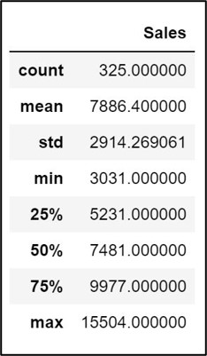
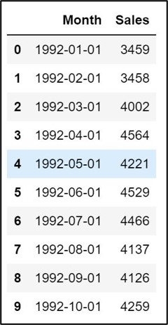
Let’s do some preliminary evaluation of the structure of the dataset using info, describe, and head methods.
input_dataframe.info()

input_dataframe.describe()
input_dataframe.head(10)
Step 4. Data Wrangling:
Using the dropna() method in pandas, ensure that we don’t have any record breaks with blanks or null values in the dataset. Also, convert the date object (“Month” field in this example) to datetime.
#Converting date object to datetime :
input_dataframe["Month"]  =  pd.to_datetime(
input_dataframe["Month"], format='%Y-%m-%d')

#Dropping NA's:
input_dataframe = input_dataframe.dropna()
Set the Datetime field as the index field:
input_dataframe = input_dataframe.set_index("Month")
Step 5. Resampling:
Resampling fundamentally involves modifying the frequency of the time-series data points. Either we would upsample or downsample the time-series observations depending on the nature of the dataset. We don’t have to resample this time-series dataset as it has already been aggregated to Month Start. Please checkout Pandas to know more about the offset aliases & resampling: https://pandas.pydata.org/pandas-docs/stable/user_guide/timeseries.html#offset-aliases
#Set the datetime index frequency
input_dataframe.index.freq = 'MS'
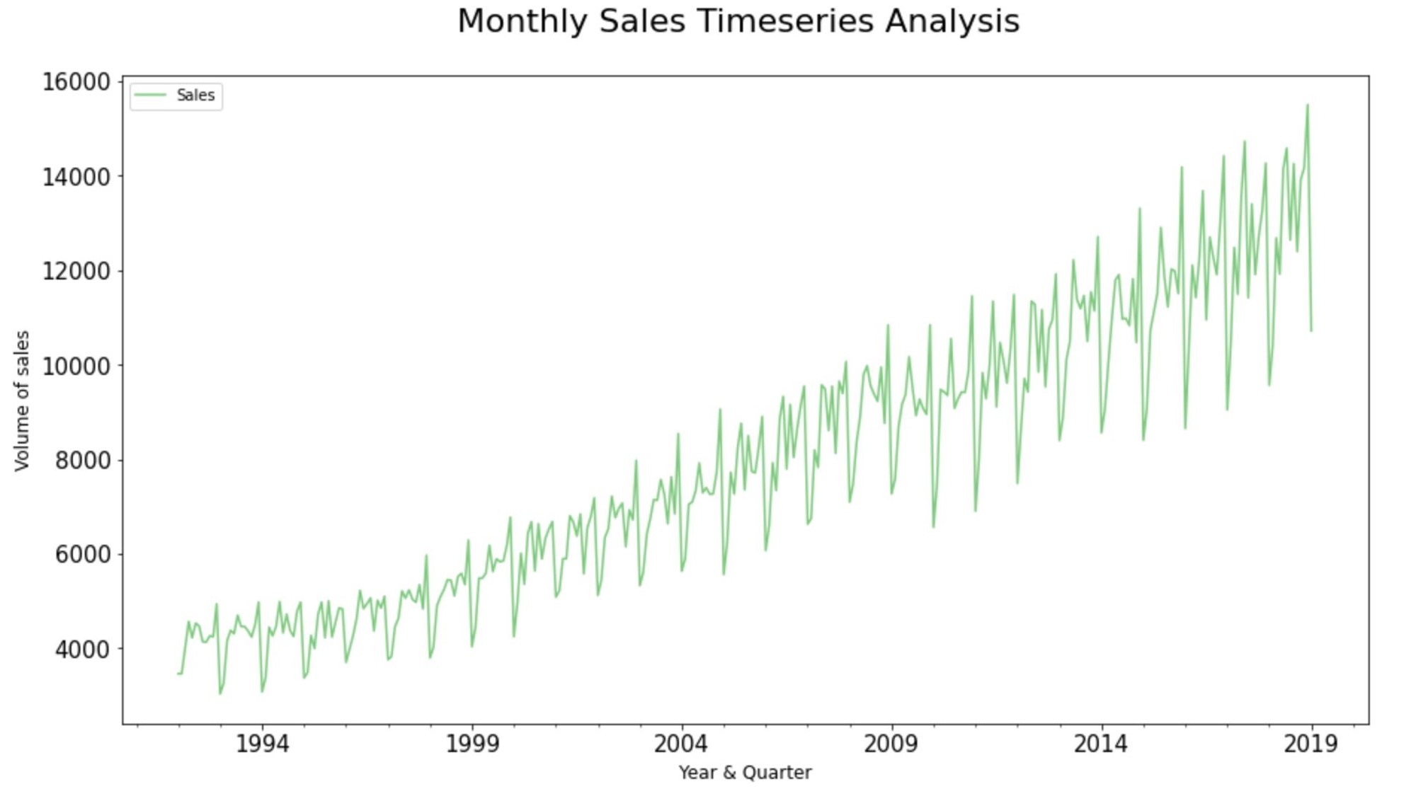
Step 6. Plot the Source Data:
#Plot the Graph:
ax =  input_dataframe['Sales'].plot.line(
title = 'Monthly Sales Timeseries Analysis',
legend =True, table = False, grid = False
, subplots = False,  figsize =(15,8),
colormap = 'Accent', fontsize = 15,
linestyle='-', stacked=False)

#Configure x and y labels:
plt.ylabel('Volume of sales',
horizontalalignment="center",
fontstyle = "normal", fontsize = "large",
fontfamily = "sans-serif")

plt.xlabel('Year & Quarter',
horizontalalignment="center",
fontstyle = "normal",
fontsize = "large",
fontfamily = "sans-serif")

#Set up title, legends and theme:
plt.title('Monthly Sales Timeseries Analysis',
horizontalalignment="center",
fontstyle = "normal",
fontsize = "22", fontfamily = "sans-serif")

plt.legend(loc='upper left', fontsize = "medium")
plt.xticks(rotation=0, horizontalalignment="center")
plt.yticks(rotation=0, horizontalalignment="right")

plt.style.use(['classic'])
ax.autoscale(enable=True, axis='x', tight=False)
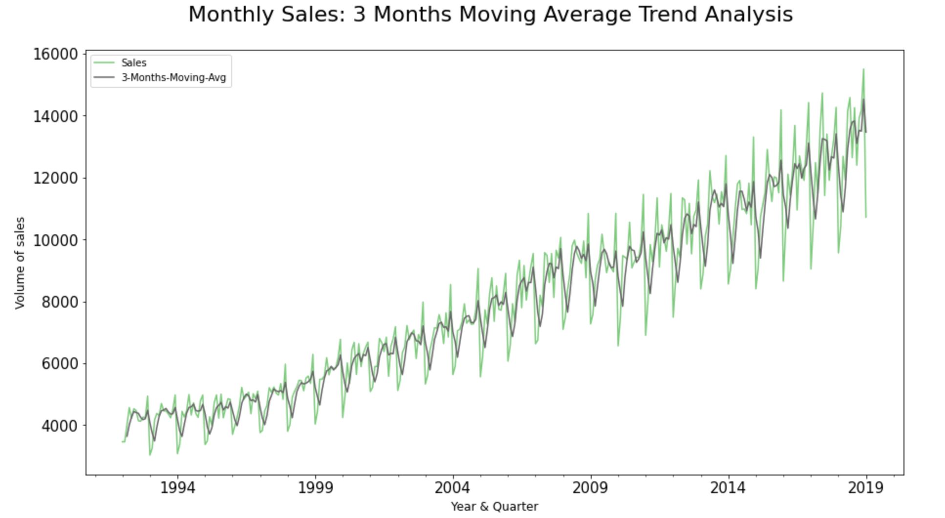
Step 7: Rolling and Expanding Time series dataset:
Rolling moving averages helps us to identify the areas of support and resistance; the areas of ‘above average inclinations’ & ‘below average declinations’ across the historic time-series observations in the dataset.
The main advantage of computing moving averages is that it filters out the noise from the random sale movements and smoothes out the fluctuations to see the average trend over a period of time.
Step 7.1. Simple Moving Average Trend Analysis:
A simple Moving Average is one of the most basic models for trend analysis on a time-series dataset. The whole idea behind rolling moving average trend analysis is to divide the data into “windows” of time, and then to calculate an aggregate function for each window.
input_dataframe["3-Months-Moving-Avg"] =
input_dataframe ["Sales"].rolling(window=3).mean()

#Plot the Graph:
ax =  input_dataframe[['Sales'
,'3-Months-Moving-Avg']].plot.line(
title = '3 Months Moving Average Trend Analysis'
,legend =True, table = False, grid = False
,subplots = False,  figsize =(15,8)
,colormap = 'Accent', fontsize = 15
,linestyle='-', stacked=False)

#Configure x and y labels:
plt.ylabel('Volume of sales',
horizontalalignment="center",
fontstyle = "normal", fontsize = "large",
fontfamily = "sans-serif")

plt.xlabel('Year & Quarter',
horizontalalignment="center",
fontstyle = "normal", fontsize = "large",
fontfamily = "sans-serif")

#Set up title, legends and theme:
plt.title('Monthly Sales:
3 Months Moving Average Trend Analysis',
horizontalalignment="center",
fontstyle = "normal", fontsize = "22",
fontfamily = "sans-serif")

plt.legend(loc='upper left', fontsize = "medium")
plt.xticks(rotation=0, horizontalalignment="center")
plt.yticks(rotation=0, horizontalalignment="right")

plt.style.use(['classic'])
ax.autoscale(enable=True, axis='x', tight=False)
From the rolling 3-months moving average trendline, we could clearly see that the retail store sales have been trending up around the mid of every quarter whilst showcasing a band of resistance towards the end of the very same quarter. Therefore, we can clearly infer that the retail store’s band of support occurs before the wave of resistance in every quarter of the calendar year.
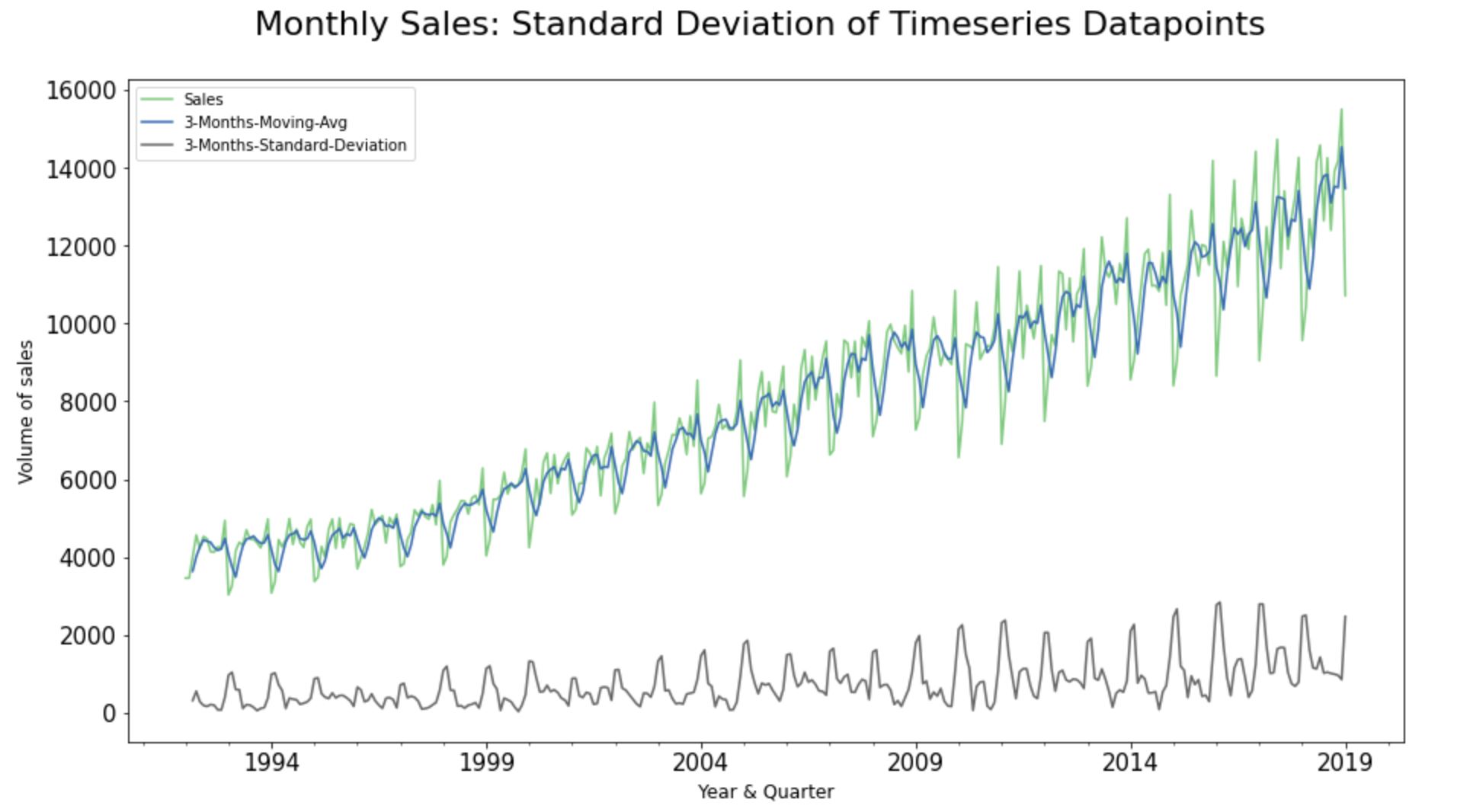
Step 7.2. Standard Deviation of Timeseries Analysis:
Standard Deviation plots essentially help us to see if the sale movements are increasing or decreasing over the course of time; giving an early indication of the stationarity in the time-series dataset.
input_dataframe ['3-Months-Moving-Avg']=
input_dataframe['Sales'].rolling(window=3).mean()
input_dataframe['3-Months-Standard-Deviation']=
input_dataframe['Sales'].rolling(window=3).std()

#Plot the Graph:
ax =  input_dataframe [['Sales',
'3-Months-Moving-Avg',
'3-Months-Standard-Deviation']].plot.line(
title = 'Standard Deviation of Timeseries Datapoints'
,legend =True, table = False, grid = False
,subplots = False,  figsize =(15,8)
,colormap = 'Accent', fontsize = 15
,linestyle='-', stacked=False)

#Configure x and y labels:
plt.ylabel('Volume of sales',
horizontalalignment="center",
fontstyle = "normal", fontsize = "large",
fontfamily = "sans-serif")

plt.xlabel('Year & Quarter',
horizontalalignment="center",
fontstyle = "normal", fontsize = "large",
fontfamily = "sans-serif")

#Set up title, legends and theme:
plt.title('Monthly Sales:
Standard Deviation of Timeseries Datapoints',
horizontalalignment="center",
fontstyle = "normal", fontsize = "22",
fontfamily = "sans-serif")

plt.legend(loc='upper left', fontsize = "medium")
plt.xticks(rotation=0, horizontalalignment="center")
plt.yticks(rotation=0, horizontalalignment="right")

plt.style.use(['classic'])
ax.autoscale(enable=True, axis='x', tight=False)
The standard Deviation of the chosen time-series dataset seems to be slightly increasing with time; hinting non-stationarity. We will get to the stationarity in subsequent steps.
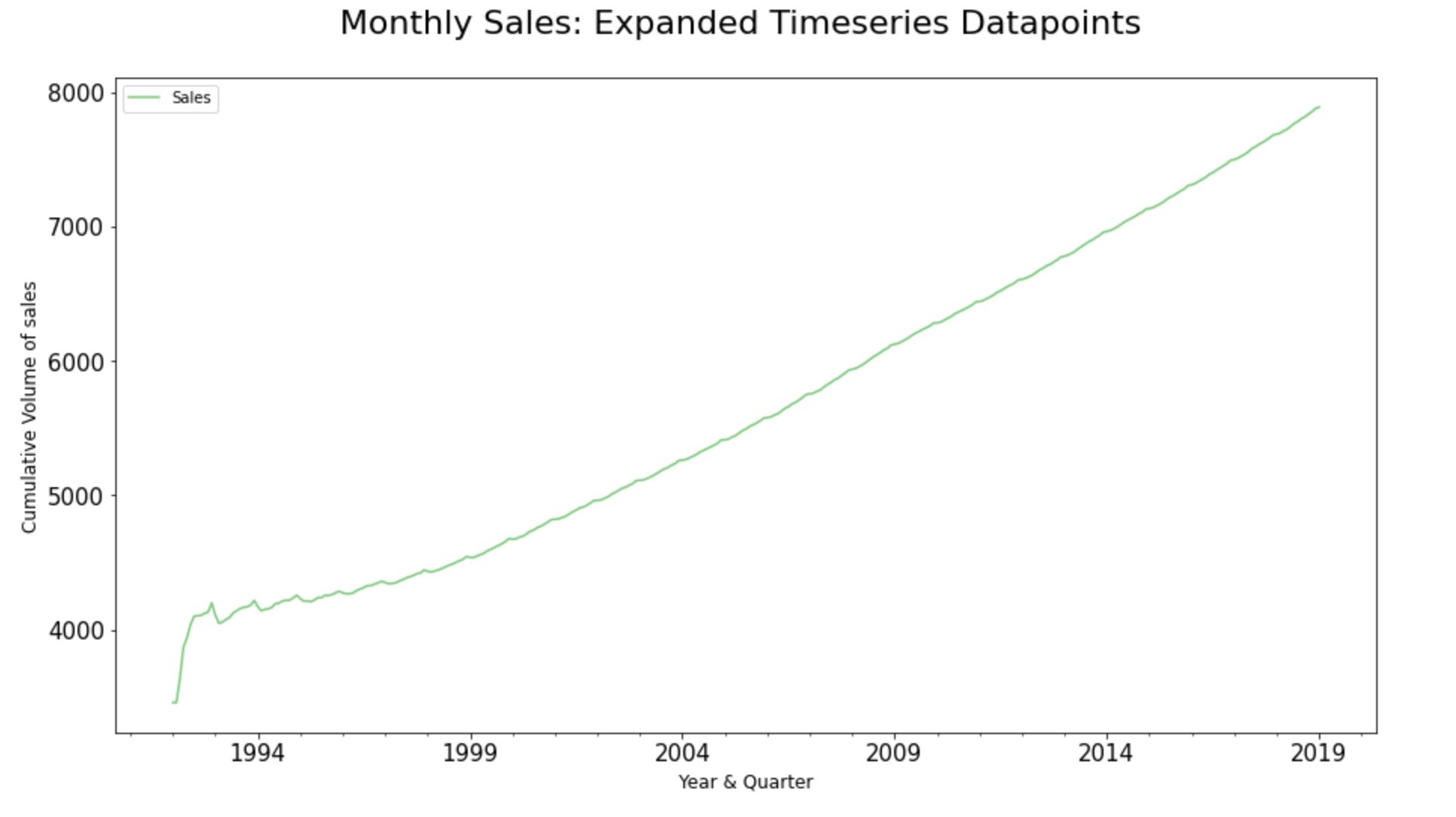
Step 7.3. Expanding Timeseries Dataset:
The expanding process in time-series analysis assists us to identify the “stability” or “volatility” of the sale movements. So, when we apply the expanding technique over a time-series dataset, we will be able to essentially see the cumulative average value of Sales across each historic time-series observations in the dataset.
#Plot the Graph:
ax =  input_dataframe['Sales'].expanding().
mean().plot.line(title =
'Expandind Timeseries Datapoints',
legend =True, table = False, grid = False,
subplots = False,  figsize =(15,8),
colormap = 'Accent', fontsize = 15,
linestyle='-', stacked=False)

#Configure x and y labels:
plt.ylabel('Cumulative Volume of sales',
horizontalalignment="center",
fontstyle = "normal", fontsize = "large",
fontfamily = "sans-serif")

plt.xlabel('Year & Quarter',
horizontalalignment="center",
fontstyle = "normal",
fontsize = "large",
fontfamily = "sans-serif")

#Set up title, legends and theme:
plt.title('Monthly Sales:
Expanded Timeseries Datapoints',
horizontalalignment="center",
fontstyle = "normal", fontsize = "22",
fontfamily = "sans-serif")
plt.legend(loc='upper left',
fontsize = "medium")
plt.xticks(rotation=0,
horizontalalignment="center")
plt.yticks(rotation=0,
horizontalalignment="right")
#plt.style.use(['classic'])
ax.autoscale(enable=True,
axis='x', tight=False)
It’s quite good to know the position of the average values across the historic timestamp; particularly during the subsequent model evaluation phases of time-series modeling. As the expanding technique eventually helps us to compare the Root Mean squared Error against the cumulative mean of the sales to understand the scale of variance.
Phase 2: Data evaluation
Step 8. Evaluate Error, Trend, and Seasonality:
A useful abstraction for selecting forecasting models is to decompose a time series into systematic and unsystematic components. Systematic: Components of the time series that have consistency or recurrence and can be described and modeled. Non-Systematic: Components of the time series that cannot be directly modeled.
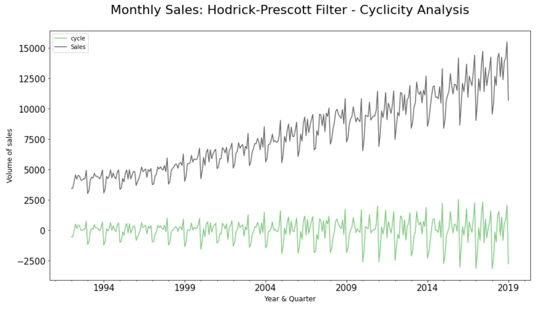
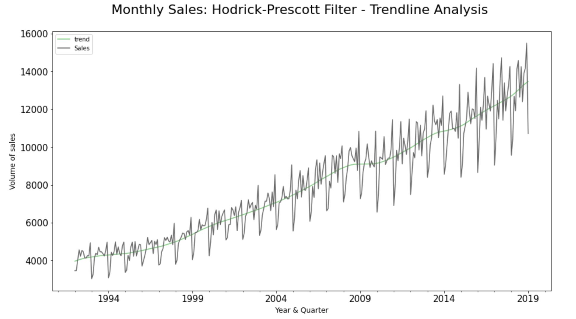
Step 8.1. Hodrick-Prescott Filter:
Hodrick-Prescott filter decomposes a time-series dataset into the trend and cyclical components.
#cyclicity
sales_cycle, sales_trend =
hpfilter(input_dataframe["Sales"], lamb = 1600)
input_dataframe["cycle"] = sales_cycle

#Plot the Graph:
ax =  input_dataframe[["cycle", "Sales"]].plot.
line(title = 'Hodrick-Prescott Filter - Cyclicity'
,legend =True, table = False, grid = False
,subplots = False,  figsize =(15,8)
,colormap = 'Accent', fontsize = 15
,linestyle='-', stacked=False)

#Configure x and y labels:
plt.ylabel('Volume of sales',
horizontalalignment="center",
fontstyle = "normal", fontsize = "large",
fontfamily = "sans-serif")

plt.xlabel('Year & Quarter',
horizontalalignment="center",
fontstyle = "normal", fontsize = "large",
fontfamily = "sans-serif")

#Set up title, legends and theme:
plt.title(' Monthly Sales:
Hodrick-Prescott Filter - Cyclicity Analysis',
horizontalalignment="center",
fontstyle = "normal", fontsize = "22",
fontfamily = "sans-serif")

plt.legend(loc='upper left', fontsize = "medium")
plt.xticks(rotation=0, horizontalalignment="center")
plt.yticks(rotation=0, horizontalalignment="right")

plt.style.use(['classic'])
ax.autoscale(enable=True, axis='x', tight=False)
A cyclic pattern exists when data exhibit rises and falls that are not of a fixed period. Also, if cyclicity values near zero, then it indicates that the data is “random”. The more the result differs from zero, the more likely some cyclicity exists. As we could see here, there is cyclicity in the chosen dataset.
#Trendline
input_dataframe ["trend"] = sales_trend

#Plot the Graph:
ax =  input_dataframe[["trend", "Sales"]].plot.
line(title = 'Hodrick-Prescott Filter - Trendline'
,legend =True, table = False, grid = False
,subplots = False,  figsize =(15,8)
,colormap = 'Accent', fontsize = 15
,linestyle='-', stacked=False)

#Configure x and y labels:

plt.ylabel('Volume of sales',
horizontalalignment="center",
fontstyle = "normal", fontsize = "large",
fontfamily = "sans-serif")

plt.xlabel('Year & Quarter',
horizontalalignment="center",
fontstyle = "normal", fontsize = "large",
fontfamily = "sans-serif")

#Set up title, legends and theme:
plt.title('Monthly Sales:
Hodrick-Prescott Filter - Trendline Analysis',
horizontalalignment="center",
fontstyle = "normal",
fontsize = "22",
fontfamily = "sans-serif")

plt.legend(loc='upper left', fontsize = "medium")
plt.xticks(rotation=0, horizontalalignment="center")
plt.yticks(rotation=0, horizontalalignment="right")

plt.style.use(['classic'])
ax.autoscale(enable=True, axis='x', tight=False)
The trendline of the observed values of the datapoints indicates an overall growth pattern at a non-linear rate over the course of time.
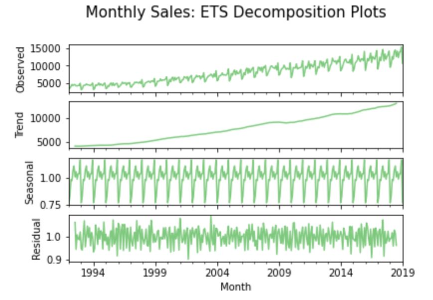
Step 8.2. Error, Trend, and Seasonality (ETS) decomposition:
A given time-series consists of three systematic components including level, trend, seasonality, and one non-systematic component called noise/error/residual. The decomposition of the time series in this section attempts to isolate these individual systematic & non-systematic components of a time-series; throwing a graph containing four aforesaid plots.
A multiplicative model is more appropriate here as sales seem to be increasing at a non-linear rate. On the other hand, we apply an ‘additive’ model on a time-series when the seasonality and trend components seem to be constant over time.
result = seasonal_decompose(input_dataframe["Sales"],
model = "multiplicative")

fig, axes = plt.subplots(4, 1, sharex=True)
result.observed.plot(ax=axes[0], legend=False,
colormap = 'Accent')
axes[0].set_ylabel('Observed')
result.trend.plot(ax=axes[1], legend=False,
colormap = 'Accent')
axes[1].set_ylabel('Trend')
result.seasonal.plot(ax=axes[2], legend=False,
colormap = 'Accent')
axes[2].set_ylabel('Seasonal')
result.resid.plot(ax=axes[3], legend=False,
colormap = 'Accent')
axes[3].set_ylabel('Residual')

plt.title('Monthly Sales:
ETS Decomposition Plots',
horizontalalignment="center",
fontstyle = "normal", fontsize = "15",
fontfamily = "sans-serif")
#plt.style.use(['classic'])
ax.autoscale(enable=True, axis='x', tight=False)
The trendline of the observed values here indicates an overall growth pattern at a non-linear rate over the course of time (similar to what we noticed in the Hodrick-Prescott Filter process). Also, there seems to be a significant seasonality variation (ranging far over zero) throughout the timestamps of the dataset at fixed intervals; hinting seasonality.
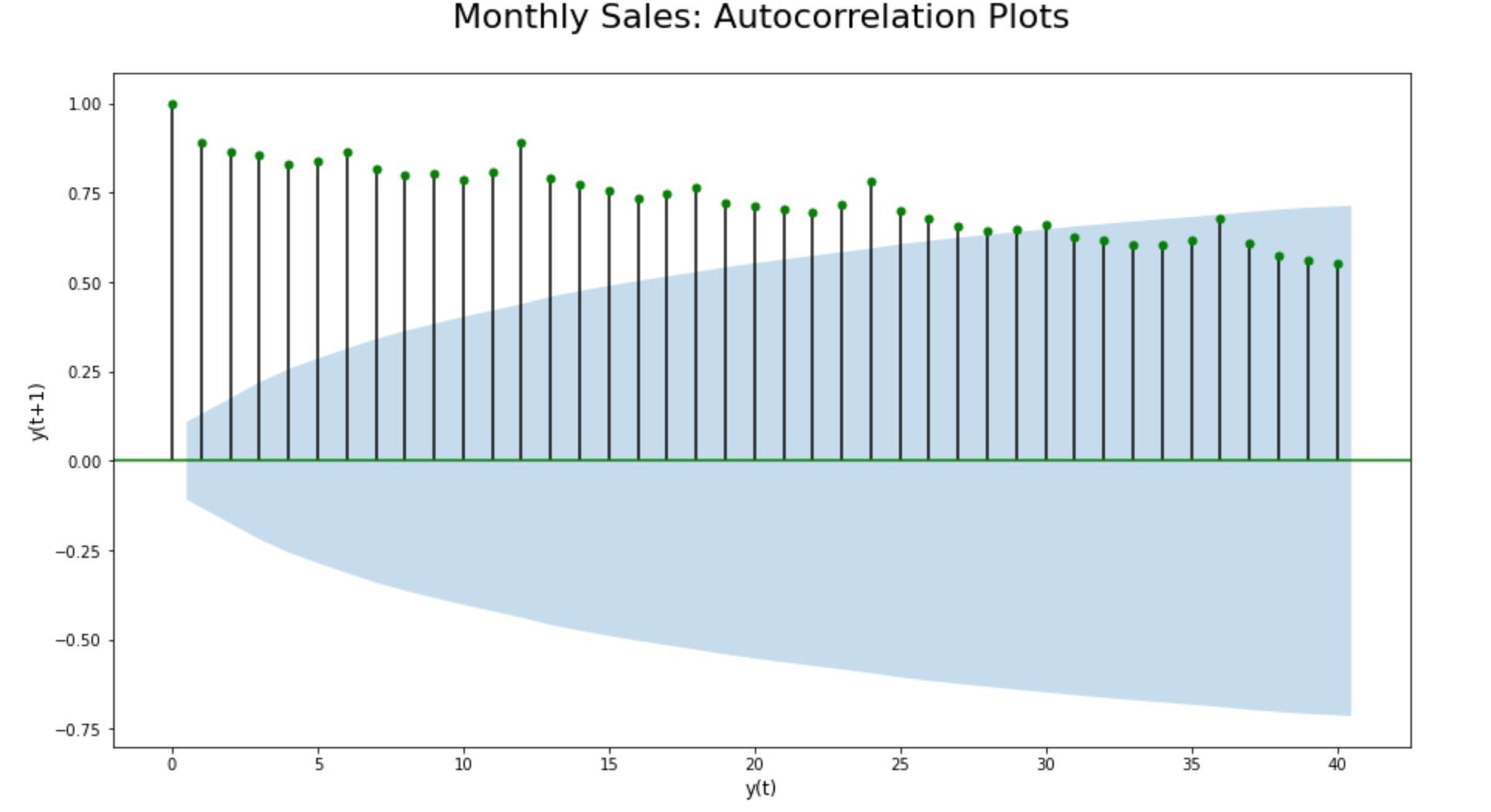
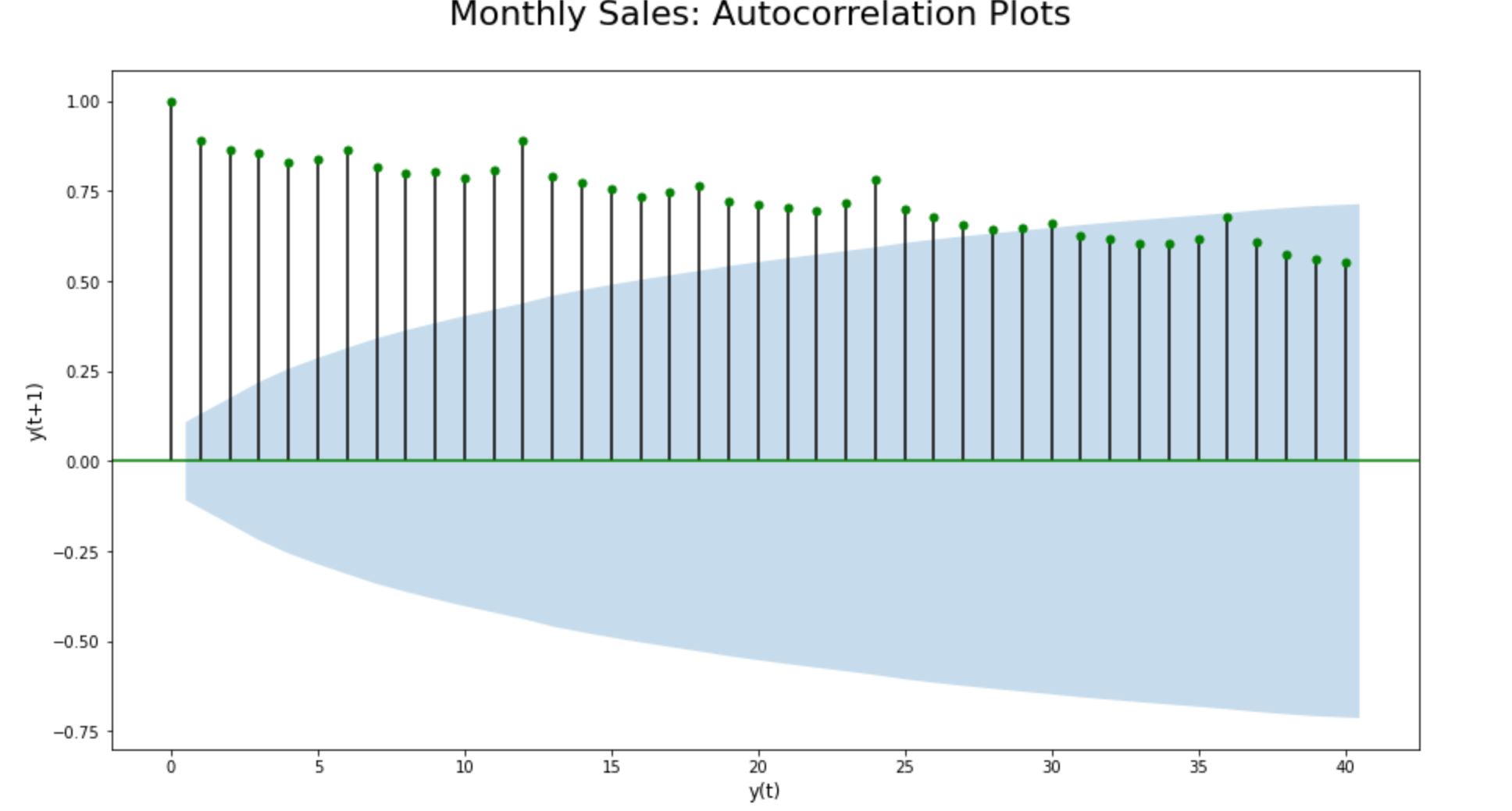
Step 8.3. Auto Correlation (ACF) Plots for seasonality check:
Autocorrelation is a type of serial dependence where a time-series is linearly related to a lagged version of itself. Lagging means nothing but “backshifting” - as simple as that. Therefore ‘lagged version of itself’ fundamentally means the datapoints get backshifted by a certain number of periods/lags.
So, if we run an autocorrelation function over the time-series dataset, we basically plot the same set of data points post backshifting it to a certain number of periods/ lags.
On average, plotting the magnitude of the autocorrelations over the first few (20-40) lags can say a lot about a time series. By doing so, we will be able to easily uncover and verify the seasonality component in time-series data.
fig = plt.figure(figsize=(15,8))
ax = fig.add_subplot(111)

acf(input_dataframe["Sales"])
lags = 40
plot_acf(input_dataframe["Sales"],
lags = lags, color = 'g', ax = ax);

#plt.figure(figsize=(15,8))
plt.title(' Monthly Sales:
Autocorrelation Plots',
horizontalalignment="center",
fontstyle = "normal", fontsize = "22",
fontfamily = "sans-serif")

plt.ylabel('y(t+1)',
horizontalalignment="center",
fontstyle = "normal",
fontsize = "large",
fontfamily = "sans-serif")

plt.xlabel('y(t)',
horizontalalignment="center",
fontstyle = "normal",
fontsize = "large",
fontfamily = "sans-serif")

plt.style.use(['classic'])
ax.autoscale(enable=True, axis='x', tight=False)
By plotting the lagged ACF, we can confirm that seasonality does exist in this time-series dataset in the first place. As the lagged ACF plot is showcasing a predictable pattern of seasonality in the data. We are able to clearly see a seasonal pattern of ups and downs consisting of a fixed number of timestamps before the second-largest positive peak erupts. Every data point seems to be strongly correlating with another data point in the future; indicating a strong seasonality in the dataset.
Step 9. Stationarity Check
Time series data is said to be stationary if it does not exhibit trends or seasonality. That is; it’s mean, variance and covariance remain the same for any segment of the series and are not functions of time.
A time-series that shows seasonality is definitely not stationary. Hence the chosen time-series dataset is non-stationary. Let’s reconfirm the non-stationarity of the time-series dataset using the automated Dickey-Fuller & KPSS tests and further by plotting the lagged autocorrelation and partial correlation functions of the dataset as shown here below:
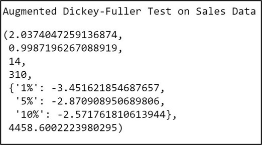
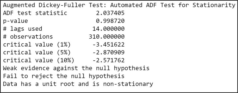
Step 9.1. Augmented Dickey-Fuller Test for stationarity:
The Augmented Dickey-Fuller test for stationarity usually involves a unit root hypothesis test, where the null hypothesis H0 states that the series is nonstationary. The alternate hypothesis H1 supports stationarity with a small p-value ( p<0.05 ) indicating strong evidence against the null hypothesis.
print('Augmented Dickey-Fuller Test on Sales Data')
input_dataframe_test = adfuller(
input_dataframe["Sales"], autolag = 'AIC')
input_dataframe_test
#For loop to assign dimensions to the metrices:

print('Augmented Dickey-Fuller Test on Sales Data')
input_dataframe_out = pd.Series(
input_dataframe_test[0:4],
index = ['ADF test statistic',
'p-value', '#lags used', '#observations'])

for key, val in input_dataframe_test[4].items():
input_dataframe_out[f'critical value ({key})'] = val
print(input_dataframe_out)
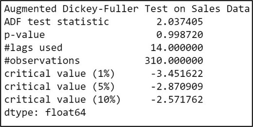
Here we have a very high p-value at 0.99 ( p>0.05 ), which provides weak evidence against the null hypothesis, and so we fail to reject the null hypothesis. Therefore we decide that our dataset is non-stationary.
Here’s is a custom function to automatically check stationarity using the ADF test:
#Custom function to check stationarity using ADF test:

def adf_test(series,title=''):
    print(
    f'Augmented Dickey-Fuller Test:
    {title}')
    result = adfuller(
    series.dropna(),autolag='AIC')
    # .dropna() handles differenced data
    labels = ['ADF test statistic',
    'p-value','# lags used',
    '# observations']
    out = pd.Series(
    result[0:4],
    index=labels)

  for key,val in result[4].items():
        out[f'critical value ({key})']=val
        print(out.to_string())

  if result[1] <= 0.05:
    print("Strong evidence against the null hypothesis")
    print("Reject the null hypothesis")
    print("Data has no unit root and is stationary")
  else:
    print("Weak evidence against the null hypothesis")
    print("Fail to reject the null hypothesis")
    print("Data has a unit root and is non-stationary")
Calling custom Augmented Dickey-Fuller function to check stationarity:
adf_test(input_dataframe["Sales"],
title = "Automated ADF Test for Stationarity")
Step 9.2. KPSS (Kwiatkowski-Phillips-Schmidt-Shin) Test for stationarity:
KPSS (Kwiatkowski-Phillips-Schmidt-Shin) Test results are directly opposite to that of the ADF test when it comes to interpreting the null and alternate hypothesis. That is; the KPSS test for stationarity usually involves a unit root hypothesis test, where the null hypothesis H0 states that the series is stationary with a large p-value ( p>0.05 ) whilst the alternate hypothesis H1 supports non-stationarity indicating weak evidence against the null hypothesis.
def kpss_test(timeseries):
    print ('Results of KPSS Test:')
    kpsstest = kpss(timeseries, regression='c')
    kpss_output = pd.Series(kpsstest[0:3],
    index=['Test Statistic','p-value',
    'Lags Used'])
for key,value in kpsstest[3].items():
    kpss_output['Critical Value (%s)'%key] = value
    print (kpss_output)
Calling custom KPSS function to check stationarity:
kpss_test(input_dataframe["Sales"])
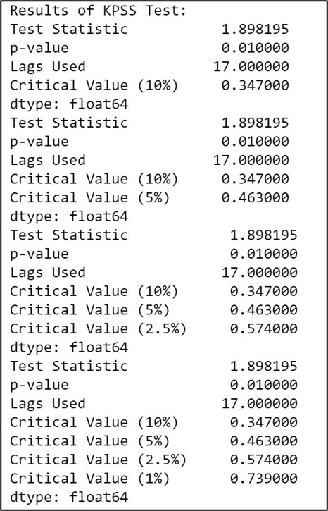
Here we have a very low p-value at 0.01 ( p<0.05 ), which provides weak evidence against the null hypothesis, indicating that our time-series is non-stationary.
Step 9.3. Revalidate non-stationarity using lag & autocorrelation plots:
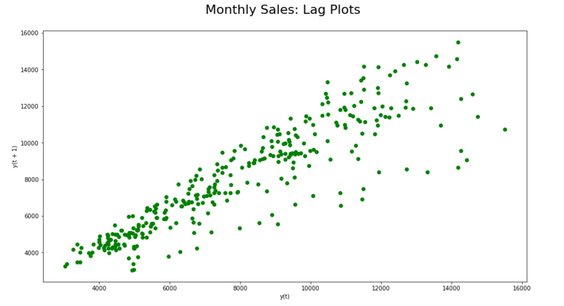
Step 9.3.1. Lag plots:
When we plot y(t) against y(t+1) on a non-stationary dataset, we will be able to find a strong autocorrelation; that is as y(t) values increase, nearby lagged values also increases.
fig = plt.figure(figsize=(15,8))
ax = fig.add_subplot(111)
lag_plot(input_dataframe["Sales"],
c= 'g', ax = ax);

plt.title('Monthly Sales: Lag Plots',
horizontalalignment="center",
fontstyle = "normal",
fontsize = "22",
fontfamily = "sans-serif")

plt.style.use(['classic'])
ax.autoscale(enable=True, axis='x', tight=False)
We could find a strong autocorrelation between y(t) and y(t+1) in the lag plots here reiterating the non-stationarity of the time-series dataset.
Step 9.3.2. Auto Correlation (ACF) plots:
As explained earlier, we could clearly see a seasonal component with no signs of sharp cut-offs or exponential decay.
fig = plt.figure(figsize=(15,8))
ax = fig.add_subplot(111)
acf(input_dataframe["Sales"])
lags = 40
plot_acf(input_dataframe["Sales"],
lags = lags, c = 'g', ax = ax);


plt.title('Monthly Sales:
Autocorrelation Plots',
horizontalalignment="center",
fontstyle = "normal",
fontsize = "22",
fontfamily = "sans-serif")

plt.ylabel('y(t+1)',
horizontalalignment="center",
fontstyle = "normal",
fontsize = "large",
fontfamily = "sans-serif")

plt.xlabel('y(t)',
horizontalalignment="center",
fontstyle = "normal",
fontsize = "large",
fontfamily = "sans-serif")

plt.style.use(['classic'])
ax.autoscale(enable=True, axis='x', tight=False)
The time series dataset clearly has a seasonal pattern of ups and downs consisting of a fixed number of timestamps before the second-largest positive peak erupts. Further, the ACF plot doesn’t decay quite quickly and remains far beyond the significance range; substantiating the non-stationarity of the time-series dataset.
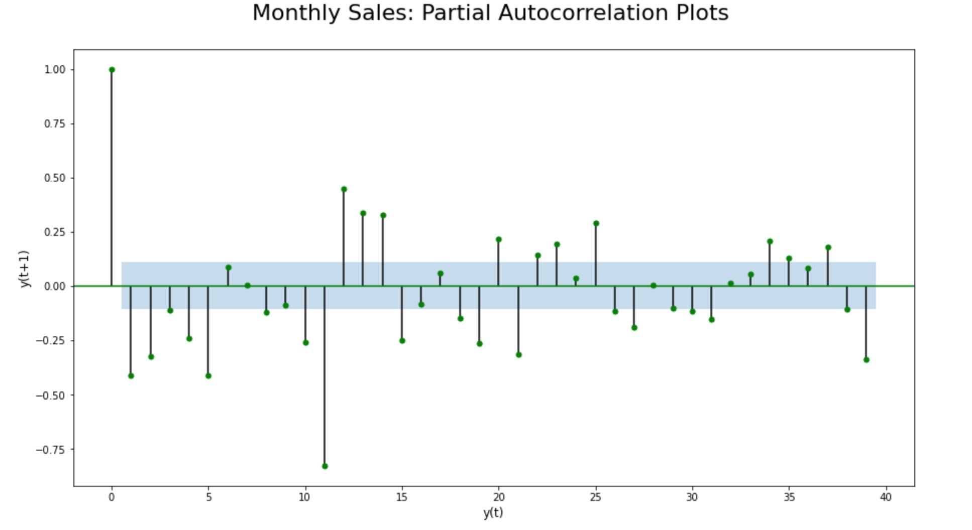
Step 9.3.3. Partial Auto Correlation (PACF) plots:
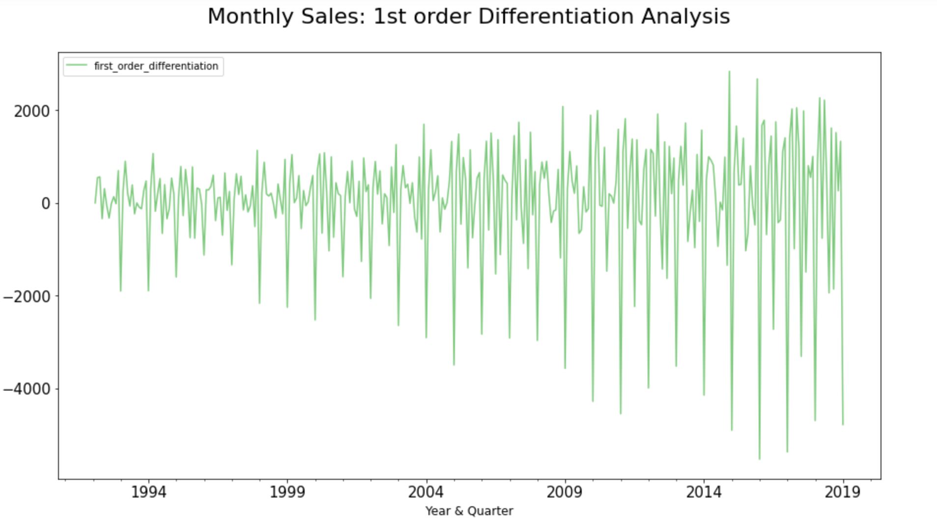
The Partial Auto Correlation (PACF) Plots can be generated only on a stationary dataset. Since the chosen time-series dataset indicates non-stationarity, we applied 1st order differencing before producing Partial Auto Correlation (PACF) plots.
input_dataframe["first_order_differentiation"]=
diff(input_dataframe["Sales"], k_diff = 1)

#Plot the Graph:

ax =  input_dataframe["first_order_differentiation"
].plot.line(title = 'Monthly Sales Timeseries Data:
1st order Differentiation',legend =True,
table = False, grid = False,subplots = False,
figsize =(15,8), colormap = 'Accent',
fontsize = 15,linestyle='-',stacked=False)

#Configure x and y labels:
plt.ylabel('Volume of sales',
horizontalalignment="center",
fontstyle = "normal",
fontsize = "large",
fontfamily = "sans-serif")

plt.xlabel('Year & Quarter',
horizontalalignment="center",
fontstyle = "normal",
fontsize = "large",
fontfamily = "sans-serif")

Set up title, legends and theme:
plt.title(' Monthly Sales:
1st order Differentiation Analysis',
horizontalalignment="center",
fontstyle = "normal",
fontsize = "22",
fontfamily = "sans-serif")

plt.legend(loc='upper left', fontsize = "medium")
plt.xticks(rotation=0, horizontalalignment="center")
plt.yticks(rotation=0, horizontalalignment="right")

plt.style.use(['classic'])
ax.autoscale(enable=True, axis='x', tight=False)
input_dataframe["first_order_differentiation"]=
diff(input_dataframe["Sales"], k_diff = 1)

fig = plt.figure(figsize=(15,8))
ax = fig.add_subplot(111)
lags = 40
plot_pacf(input_dataframe["first_order_differentiation"
].dropna(), lags = np.arange(lags), c='g', ax = ax);

plt.title('Monthly Sales:
Partial Autocorrelation Plot',
horizontalalignment="center",
fontstyle = "normal", fontsize = "22",
fontfamily = "sans-serif")

plt.ylabel('y(t+1)',
horizontalalignment="center",
fontstyle = "normal",
fontsize = "large",
fontfamily = "sans-serif")

plt.xlabel('y(t)',
horizontalalignment="center",
fontstyle = "normal",
fontsize = "large",
fontfamily = "sans-serif")

plt.style.use(['classic'])
ax.autoscale(enable=True, axis='x', tight=False)
PACF plot of the data points with first-order differencing shows sharp cut-offs or exponential decay, indicating stationarity at the first-order integration. Also, the PACF plot decay quite quickly and remains largely within the significance range (the blue shaded area), strengthening the hypothesis that the chosen time-series dataset is non-stationary by default.
Phase 3: Model Selection
Step 10. Split the dataset into training and test set
len(input_dataframe)
training_dataframe = input_dataframe.iloc[
:len(input_dataframe)-23, :1]
testing_dataframe = input_dataframe.iloc[
len(input_dataframe)-23:, :1]
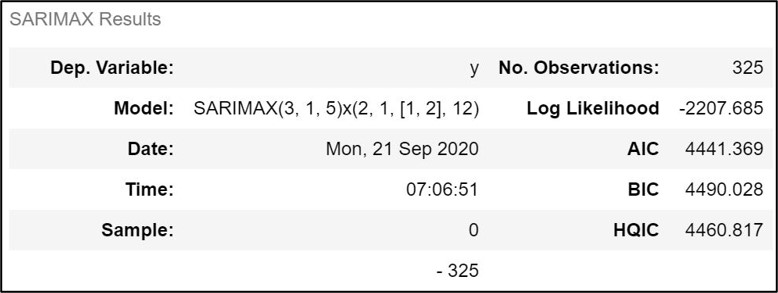
Step 11.1. Determining ARIMA orders:
Since the dataset is seasonal and non-stationary, we need to fit a SARIMA model. SARIMA is an acronym that stands for Seasonal AutoRegressive Integrated Moving Average; a class of statistical models for analyzing and forecasting time series data when it is seasonal and non-stationary. It is nothing but an extension to ARIMA that supports the direct modeling of the seasonal component of the series.
A standard notation of ARIMA is (p,d,q) where the parameters are substituted with integer values to quickly indicate the specific ARIMA model being used. The parameters of the ARIMA model are:
p: The number of lag observations included in the model, also called the lag order.
d: The number of times that the raw observations are differenced, also called the degree of differencing.
q: The size of the moving average window, also called the order of moving average.
Each of these components is explicitly specified in the model as a parameter. In SARIMA, it further adds three new hyperparameters to specify the autoregression (AR), differencing (I), and moving average (MA) of the seasonal components of the series, as well as an additional parameter for the period of the seasonality.
Therefore in this section, we are essentially trying to identify the order of p,d,q and P, D, Q and m (that is; the order of Auto Regression, Integration, and Moving Average Components along with the seasonal regression, differencing and moving average coefficients ) to be applied over the time-series dataset to fit the SARIMA model.
Step 11.1.1. ARIMA orders using pmdarima.auto_arima:
auto_arima(input_dataframe["Sales"],
seasonal = True, m=12,
error_action = "ignore").summary()
auto_arima suggests that we should fit the following SARIMA model (3,1,5)(2,1,1,12) to best forecast future values of the chosen time series dataset. Let’s try to revalidate the orders through the stepwise AIC Criterion method in the next step.
Stepwise 11.1.2. Revalidating ARIMA orders using stepwise auto_arima:
stepwise_fit = auto_arima(
input_dataframe["Sales"], start_p = 0
,start_q = 0,max_p =3, max_q = 5
,m=12, seasonal = True, d=None,
trace = True, error_action ='ignore'
,suppress_warnings = True,stepwise = True)
Stepwise auto_arima gives us the breakdown of all the possible ‘Akaike information criterion’ or AIC scores in the list. Stepwise fit has retrieved the same results; highlighting the right order of autoregression, integration, and moving average coefficients to be used while fitting the SARIMA model over the chosen time-series dataset.

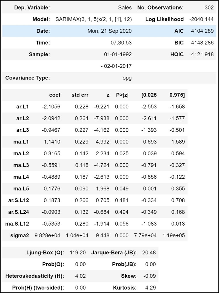
Step 11.2. Fit SARIMA Model:
Fit SARIMA model over the training dataset as shown here below:
fitted_SARIMA_model = SARIMAX(training_dataframe["Sales"]
,order =(3,1,5), seasonal_order = (2,1,1,12))
results = fitted_SARIMA_model.fit()
results.summary()
Phase 4: Model Evaluation
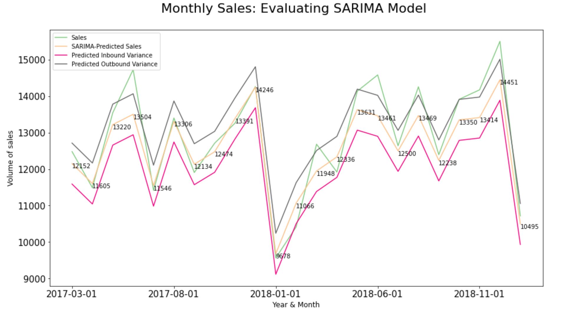
Step 12.1. Evaluate the SARIMA Model:
start = len(training_dataframe)
end = len(training_dataframe)+len(testing_dataframe)-1
test_SARIMA_predictions = results.predict(start = start,
end = end).rename('SARIMA Predictions')

#Root Mean Squared Error
np.sqrt(mean_squared_error(
testing_dataframe, test_SARIMA_predictions))
Step 12.2. Build variance - Inbound and Outbound values for predictions:
test_SARIMA_predictions = pd.DataFrame(
test_SARIMA_predictions)

test_SARIMA_predictions[
"inbound_variance"] =
(test_SARIMA_predictions[
"SARIMA Predictions"]-562.176565188264).
round(decimals =0)

test_SARIMA_predictions["outbound_variance"]=
(test_SARIMA_predictions[
"SARIMA Predictions"]+562.176565188264).
round(decimals = 0)

test_SARIMA_predictions=
test_SARIMA_predictions.join(testing_dataframe)

test_SARIMA_predictions
Step 12.3. Compare predictions to expected values of the test set:
test_SARIMA_predictions =
test_SARIMA_predictions.reset_index()

print(test_SARIMA_predictions.columns)
type(test_SARIMA_predictions["index"])

test_SARIMA_predictions["Month"]=
test_SARIMA_predictions["index"].rename("Month")

test_SARIMA_predictions["Month"]=
test_SARIMA_predictions["Month"].dt.strftime('%Y-%m-%d')

test_SARIMA_predictions.set_index("Month", inplace=True)

test_SARIMA_predictions[["Sales",
"SARIMA-Predicted Sales",
'Predicted Inbound Variance',
'Predicted Outbound Variance']] =
test_SARIMA_predictions[[
"Sales", "SARIMA-Predicted Sales",
'Predicted Inbound Variance',
'Predicted Outbound Variance']] .astype(int)

#Plot the Graph:
ax = test_SARIMA_predictions[["Sales",
"SARIMA-Predicted Sales",
"Predicted Inbound Variance",
"Predicted Outbound Variance"]].plot.
line( title = 'Monthly Sales:
Evaluating SARIMA Model',legend =True,
table = False,grid = False,subplots = False,
figsize =(15,8),colormap = 'Accent',
fontsize = 15,linestyle='-', stacked=False)

x=  pd.Series (range (0, len(
test_SARIMA_predictions), 1))
for i in x:
ax.annotate(test_SARIMA_predictions[
"SARIMA-Predicted Sales"][i],
xy=(i,test_SARIMA_predictions[
"SARIMA-Predicted Sales"][i]),
xycoords='data',xytext=(i,test_SARIMA_predictions[
"SARIMA-Predicted Sales"][i]+5 ),textcoords='data',
arrowprops=dict(arrowstyle="->",connectionstyle="angle3",
facecolor='black'),horizontalalignment='left',
verticalalignment='top')

#Configure x and y labels:
plt.ylabel('Volume of sales',
horizontalalignment="center",
fontstyle = "normal",
fontsize = "large",
fontfamily = "sans-serif")

plt.xlabel('Year & Month',
horizontalalignment="center",
fontstyle = "normal",
fontsize = "large",
fontfamily = "sans-serif")

#Set up title, legends and theme:
plt.title('Monthly Sales:
Evaluating SARIMA Model',
horizontalalignment="center",
fontstyle = "normal",
fontsize = "22",
fontfamily = "sans-serif")

plt.legend(loc='upper left', fontsize = "medium")
plt.xticks(rotation=0, horizontalalignment="center")
plt.yticks(rotation=0, horizontalalignment="right")

plt.style.use(['classic'])
ax.autoscale(enable=True, axis='x', tight=False)
Phase 5: Forecast into Future
Step 13.1. Fit the chosen forecasting model on the full dataset:
final_model = SARIMAX(input_dataframe["Sales"],
order = (3,1,5), seasonal_order = (2,1,1,12))
SARIMAfit = final_model.fit()
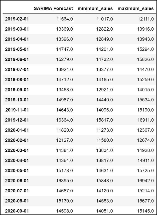
Step 13.2. Obtain Predicted values for the full dataset:
forecast_SARIMA_predictions = SARIMAfit.predict(start=
len(input_dataframe),end =len(input_dataframe)+23,
dynamic = False, typ = 'levels').rename ('Forecast')
Step 13.3. Build variance: Inbound and Outbound variances:
forecast_SARIMA_predictions=
pd.DataFrame(forecast_SARIMA_predictions)

forecast_SARIMA_predictions=
forecast_SARIMA_predictions.rename(columns =
{'Forecast': "SARIMA Forecast"})

forecast_SARIMA_predictions["minimum_sales"]=
(forecast_SARIMA_predictions [
"SARIMA Forecast"]-546.9704996461452).
round(decimals = 0)

forecast_SARIMA_predictions["maximum_sales"]=
(forecast_SARIMA_predictions ["SARIMA Forecast"]+
546.9704996461452).round(decimals = 0)

forecast_SARIMA_predictions["SARIMA Forecast"]=
forecast_SARIMA_predictions["SARIMA Forecast"].
round(decimals = 0)

forecast_SARIMA_predictions.to_csv('output.csv')

forecast_SARIMA_predictions
Step 13.4. Plot predictions against known values:
forecast_SARIMA_predictions1=
forecast_SARIMA_predictions

forecast_SARIMA_predictions1=
forecast_SARIMA_predictions1.reset_index()

print(forecast_SARIMA_predictions1.columns)
type(forecast_SARIMA_predictions1["index"])

forecast_SARIMA_predictions1["Month"]=
forecast_SARIMA_predictions1["index"].rename("Month")

forecast_SARIMA_predictions1["Month"]=
forecast_SARIMA_predictions1["Month"].dt.
strftime('%Y-%m-%d')

forecast_SARIMA_predictions1=
forecast_SARIMA_predictions1.drop(['index'], axis=1)

forecast_SARIMA_predictions1.
set_index("Month", inplace=True)

forecast_SARIMA_predictions1[["SARIMA-Forecasted Sales",
'Minimum Sales','Maximum Sales']]
= forecast_SARIMA_predictions[[
"SARIMA - Forecasted Sales",'Minimum Sales',
'Maximum Sales']] .astype(int)


#Plot the Graph:
ax = forecast_SARIMA_predictions1[[
"SARIMA - Forecasted Sales",
'Minimum Sales','Maximum Sales']].plot.line(
title = 'Predicting Monthly Sales: SARIMA Model',
legend =True, table = False, grid = False,
subplots = False,  figsize =(15,8),
colormap = 'Accent', fontsize = 15,
linestyle='-', stacked=False)

x=  pd.Series (range (0, len(
forecast_SARIMA_predictions1),1))
for i in x:
ax.annotate(forecast_SARIMA_predictions1[
"SARIMA - Forecasted Sales"][i],
xy=(i,forecast_SARIMA_predictions1[
"SARIMA - Forecasted Sales"][i]),
xycoords='data',xytext=(i,
forecast_SARIMA_predictions1[
"SARIMA - Forecasted Sales"][i]+5),
textcoords='data',
#arrowprops=dict(arrowstyle="-",
#facecolor='black'),
#horizontalalignment='left',
verticalalignment='top')


#Configure x and y labels:
plt.ylabel('Volume of sales',
horizontalalignment="center",
fontstyle = "normal",
fontsize = "large",
fontfamily = "sans-serif")

plt.xlabel('Year & Month',
horizontalalignment="center",
fontstyle = "normal",
fontsize = "large",
fontfamily = "sans-serif")

#Set up title, legends and theme:
plt.title('Predicting Monthly Sales: SARIMA Model',
horizontalalignment="center",
fontstyle = "normal",
fontsize = "22",
fontfamily = "sans-serif")

plt.legend(loc='upper left', fontsize = "medium")
plt.xticks(rotation=0, horizontalalignment="center")
plt.yticks(rotation=0, horizontalalignment="right")

plt.style.use(['classic'])
ax.autoscale(enable=True, axis='x', tight=False)
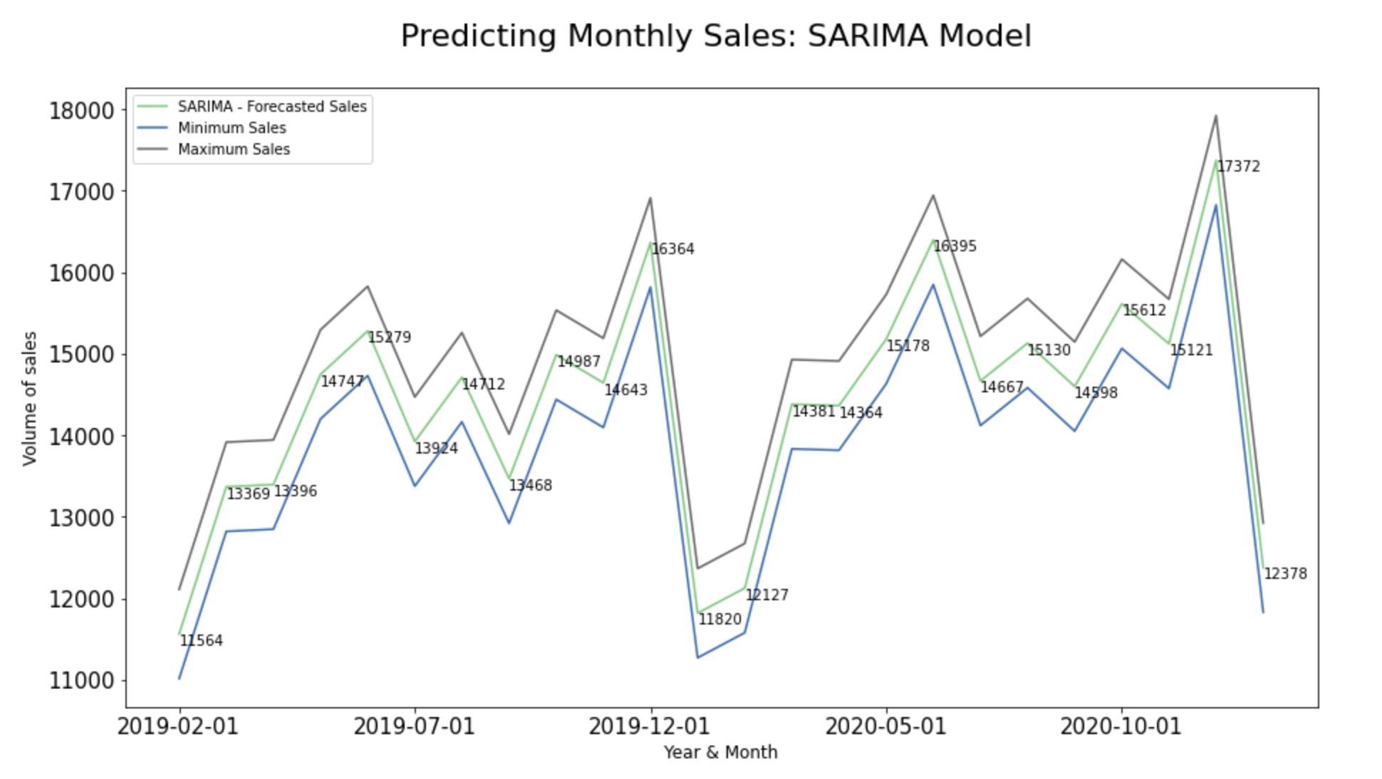
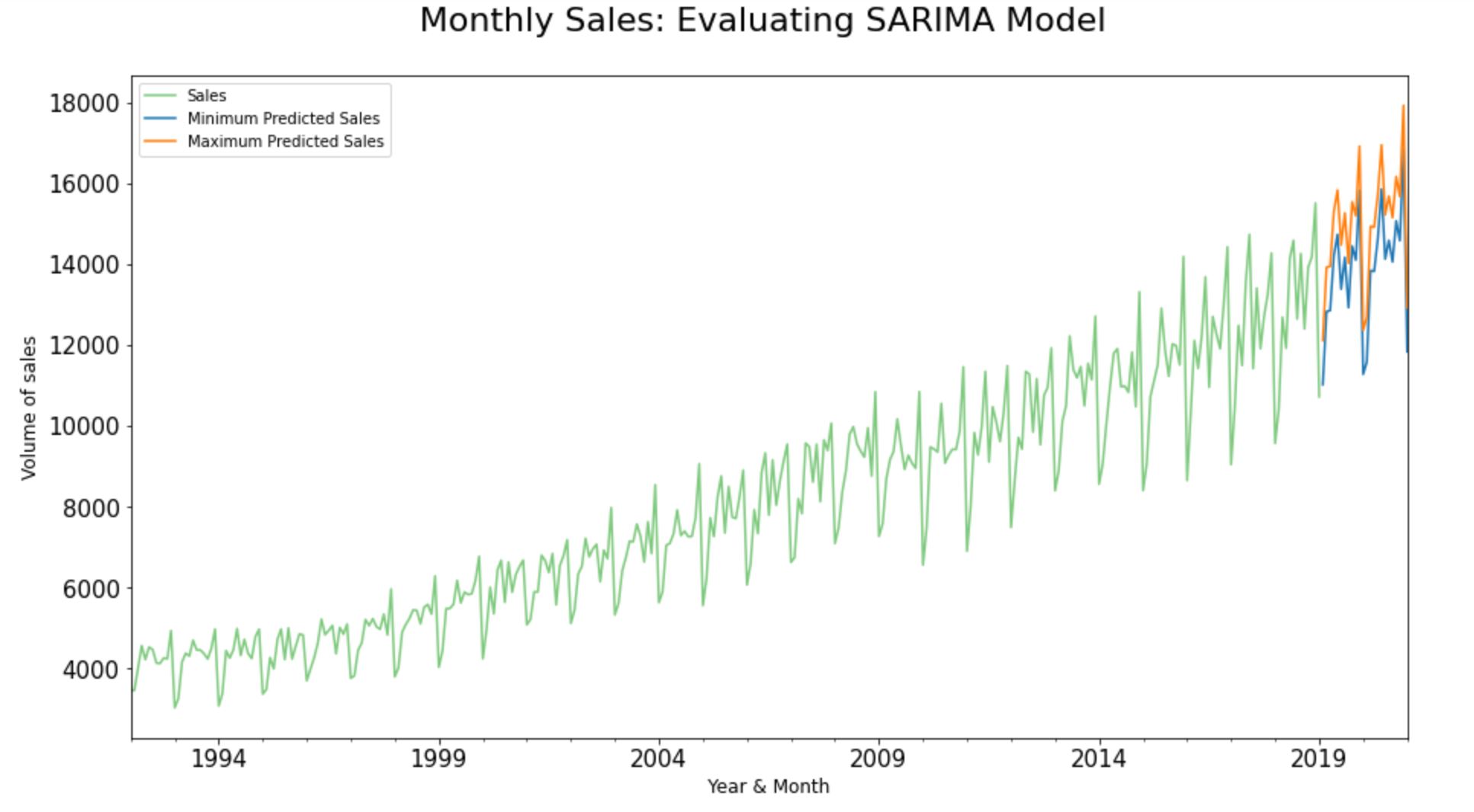
Unpredictability and risk are the close companions of any predictive models. In the real world, we may not be able to always pinpoint our actual sales to an absolute predicted value.
In fact, more than an absolute value, it is generally considered as a good practice in the industry to reap insights based on the degree of unpredictability attaching to forecasts. Hence, let’s combine the past and present data from the input dataset along with the predicted inbound/ outbound variance to forecast the forthcoming sales in months to come.
input_dataframe["Sales"].plot.line(
title = 'Monthly Sales:Evaluating SARIMA Model',
legend =True, table = False, grid = False
,subplots = False,figsize =(15,8),colormap = 'Accent'
,fontsize = 15,linestyle='-', stacked=False)

#forecast_SARIMA_predictions["SARIMA Forecast"].plot(
legend = True, label = "SARIMA Forecast")
forecast_SARIMA_predictions["Minimum Sales"].plot(
legend = True, label = "Minimum Predicted Sales")
forecast_SARIMA_predictions["Maximum Sales"].plot(
legend = True, label = "Maximum Predicted Sales")

#Configure x and y labels:
plt.ylabel('Volume of sales',
horizontalalignment="center",
fontstyle = "normal",
fontsize = "large",
fontfamily = "sans-serif")

plt.xlabel('Year & Month',
horizontalalignment="center",
fontstyle = "normal",
fontsize = "large",
fontfamily = "sans-serif")

#Set up title, legends and theme:
plt.title('Monthly Sales:
Evaluating SARIMA Model',
horizontalalignment="center",
fontstyle = "normal",
fontsize = "22",
fontfamily = "sans-serif")

plt.legend(loc='upper left', fontsize = "medium")
plt.xticks(rotation=0, horizontalalignment="center")
plt.yticks(rotation=0, horizontalalignment="right")

plt.style.use(['classic'])
ax.autoscale(enable=True, axis='x', tight=False)
Conclusion
So, in a nutshell, we made use of a time-stamped sales dataset from Kaggle and predicted its future data points with a realistic inbound and outbound variance using the Statsmodels library in Python. Also, at every juncture, we visualized the outputs using pandas.plot() and Matplotlib to reap insights.
What’s Next?
Predicting future datapoints is only half of the story. In the real world, the project gets rolled out when the insights have been shared in a comprehendible manner to the internal/ external stakeholders so that they would be able to take strategic business decisions from time to time.
1) So, let’s ensure that we plug the final output dataset into the organization’s BI platform (like Tableau/ Power BI/ Qlik, etc.) and build a data story highlighting the key findings of the project.
2) The whole process of translating the findings while building the data story largely depends on our knowledge about the industry and the business unit that we are associated with.
3) Share the insights with the internal/external stakeholders of the organization along with the dashboard so that they could strategize the marketing/ sales/financial initiatives accordingly.
4) We could apply the very same Statsmodels library in python to forecast the time-stamped future leads/price/web traffic/revenue etc.
GitHub Repository
I have learned (and continue to learn) from many folks in Github. Hence sharing my entire python script and supporting files in a public GitHub Repository in case if it benefits any seekers online. Also, feel free to reach out to me if you need any help in understanding the fundamentals of predicting timestamped datapoints using ARIMA models in Python. Happy to share what I know:) Hope this helps!
About the Author
Sree is a Marketing Data Scientist and seasoned writer with over a decade of experience in data science and analytics, focusing on marketing and consumer analytics. Based in Australia, Sree is passionate about simplifying complex topics for a broad audience. His articles have appeared in esteemed outlets such as Towards Data Science, Generative AI, The Startup, and AI Advanced Journals. Learn more about his journey and work on his portfolio - his digital home.